
Care/of — A unified app experience to create, track and adapt a holistic health routine
SERVICES
User Research, User Interface, User Experience, Visual Direction
DESCRIPTION
The Care/of app helps people build healthy routines with the right products, activities, motivation, and guidance to live their best lives. The upgraded tracking includes routine elements beyond Care/of supplements to support users' health goals in order to provide them with better habit formation, visible results and recommendations all while being simple, delightful, and rewarding.

Meet Lexi
- Woman in her 30's who is married and starting to think about kids
- College educated and works a full time job while living in the suburbs
- She likes effective, easy solutions that help her stay on track with her routine and achieve her health goals
- She dislikes anything cumbersome that interferes with her busy day and her high bar for achievement
- She is ambitious but feeling stretched from taking on too much. She's hard on herself about taking a breather and about putting her own needs last

App vision
Product led a project to establish the shared vision for our mobile app. Nearly 30 vision submissions covered 8 major buckets, which were then compared to each other from a business perspective. A downside mitigation exercise across all key departments landed us with the below guiding principles.
Keep it simple
Consider using things like wearables and smart speakers to ease tracking lift.
Deliver outsized value
Be proactive in terms of guidance and create a valuable standalone experience.
Help her feel less alone
Give her permission to prioritize herself and never make her feel guilty.
Meet her where she is at
Don’t be a taskmaster and think about routines more broadly than daily activities.
Problem statement
Customers are trying things outside of taking supplements to try to feel better or maintain their wellbeing across their health goals. They struggle to know what they should be doing, they struggle to find the time to do these things and they struggle to build habits. By making it possible to support their health goals easily and quickly with no judgment and lots of positive feedback, we can make them healthier.
User needs
Me time
Encourage her to take time for herself daily, in low-burden ways, and to celebrate the little things she does for herself and others.
________
Adaptive content that provides postiive affirmations in real time
Simple interactions and delightful design to create a supportive experience
Guidance
She wants to understand the effects of what she's taking. Provide her with a greater understanding of her plan.
________
Make recommendations to level up, remove or replace behaviors
Communicate insights based on feeling log, quiz and tracking data for personalization
Results
She’s not sure if what she’s doing will maximize benefits. Help her create a routine with demonstrable benefits.
_______
Show how well they are doing over time with health journey maps and milestones
Show correlations between what they do and how they feel
Consistency
Every day is an ambitious slate of obligations. Offer solutions that are easy and enjoyable to help form new habits.
_______
Use cognitive behavioral science backed methods for habit building
Gamify to motivate the community through challenges and accountability buddies
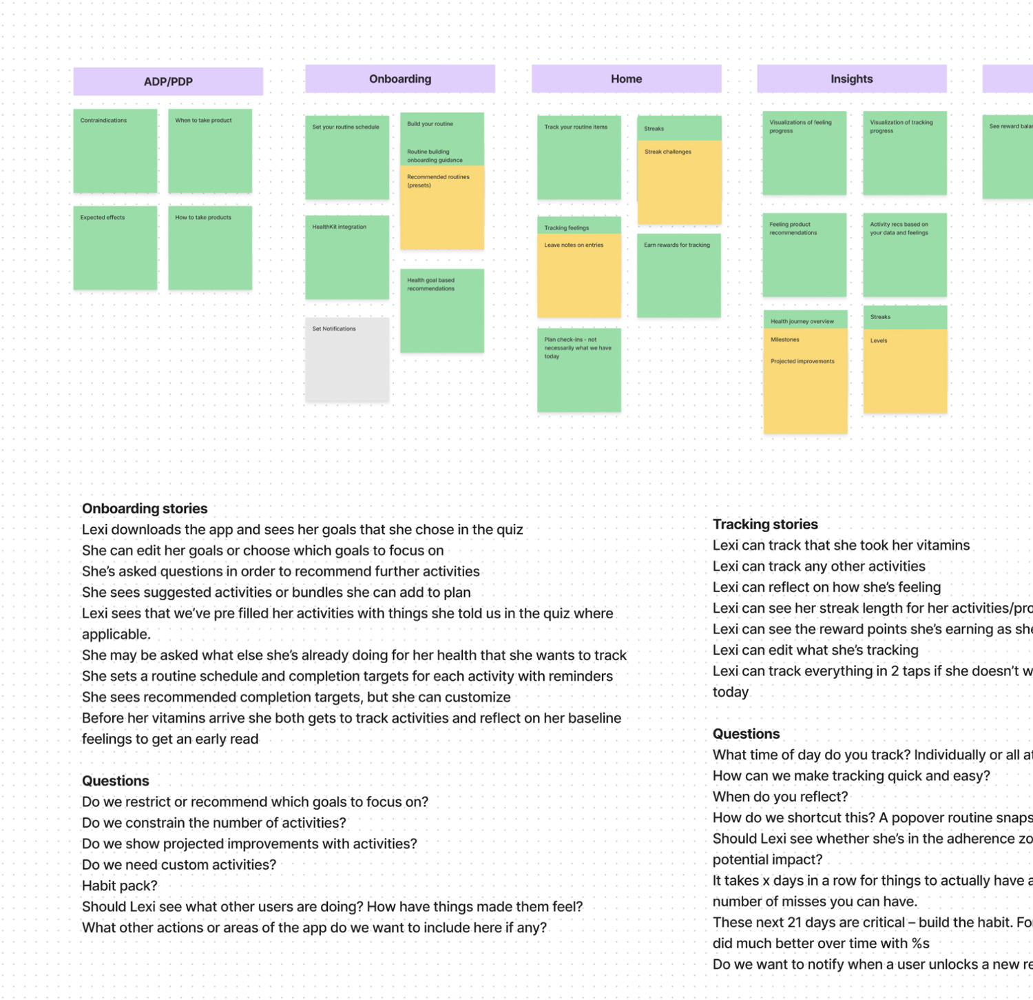
Product planning
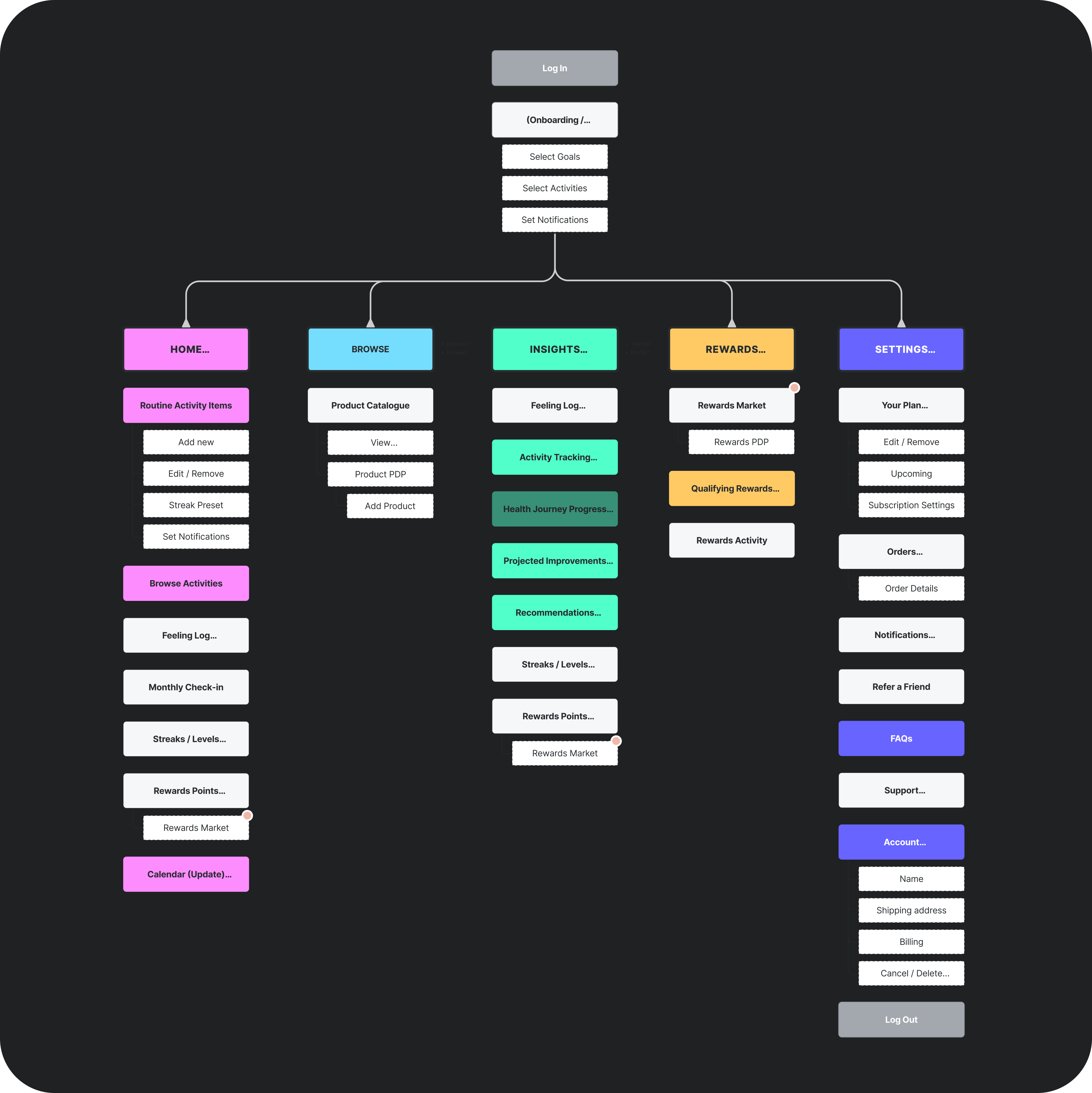
We held a several day onsite to research, ideate and align. We determined and prioritized our value props based on these app principles. A north star feature set was determined that laddered up to the value props. At the end of the onsite, we had a new information architecture, rough interface sketches, MVP features, and a narrowed down list of user stories for the MVP.

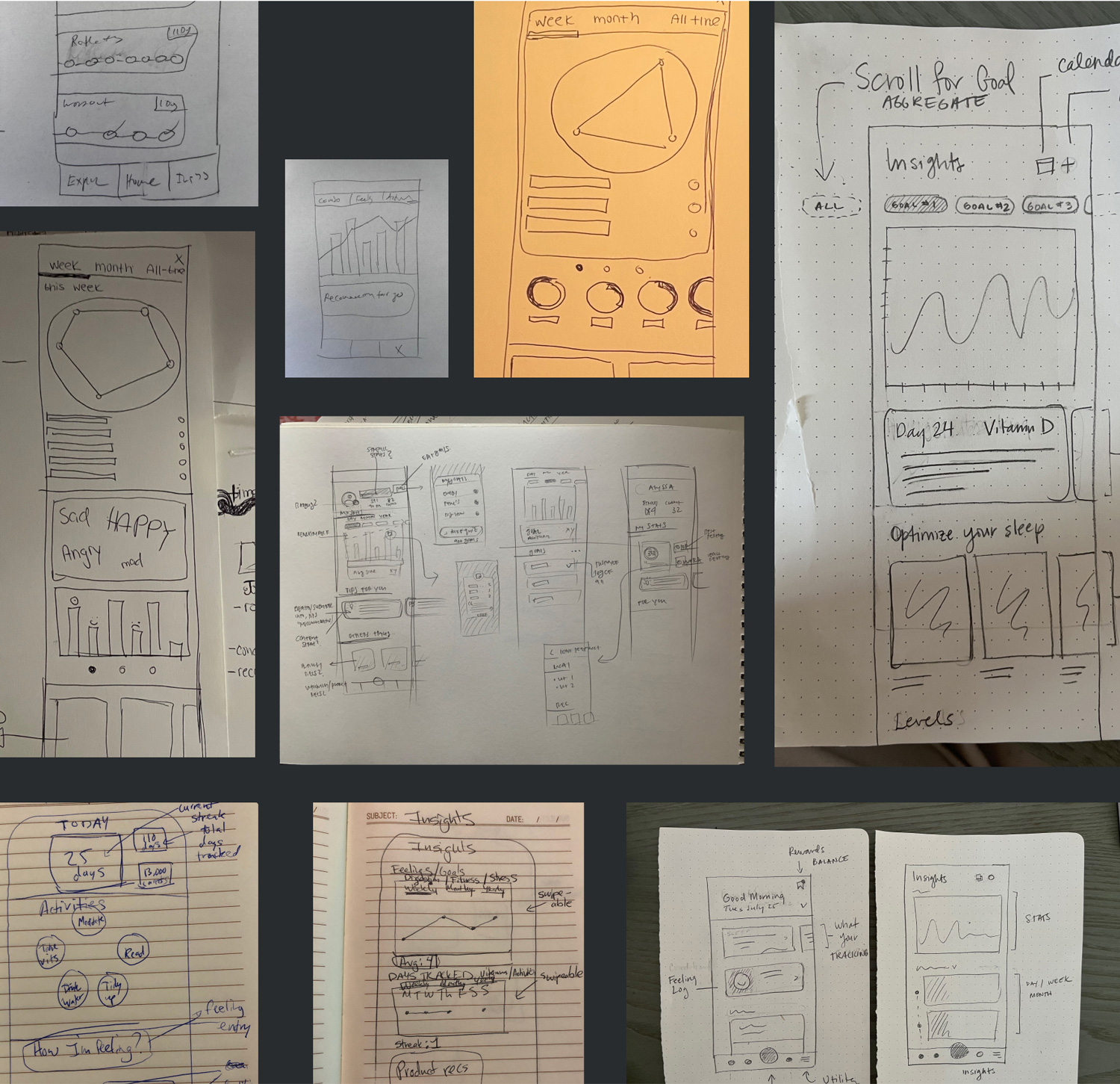
Concept testing
We conducted three rounds of qualitative user testing and one round of useability testing during the initial MVP design process to better design a product that works for our target users.
Motivation
We wanted to understand what motivated users to track and do things for their health. We tested rewards, wellness scores, and daily progress as motivation tactics.
Initial concepts
Once we understood that users are motivated by rewards, we compiled three divergent design options for testing. The tile direction below was an early winner for its usability.

Refining concepts
We aimed to find a solution that was motivating, flexible, and easy-to-use. We learned that users found the daily progress visual most compelling.

Final direction
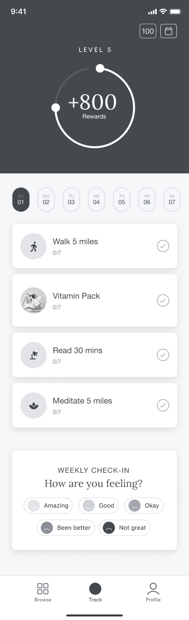
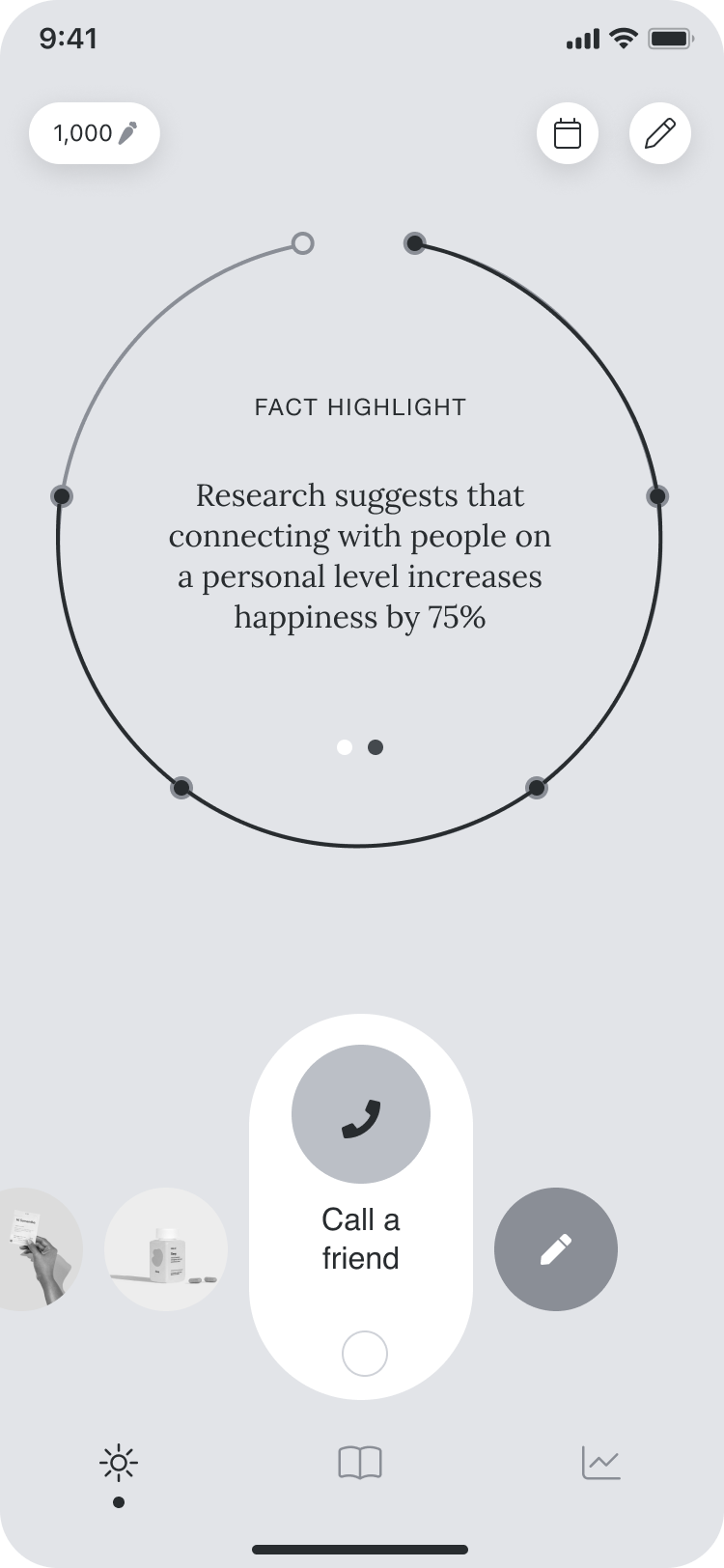
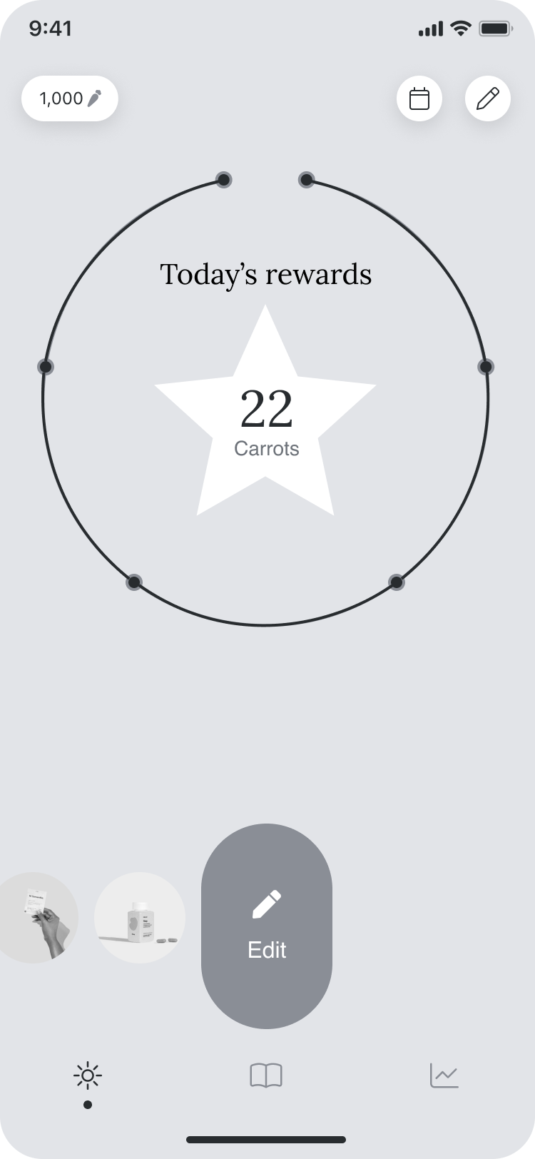
We decided the daily progress visual was the strongest direction for the business due to it's differentiation and stronger alignment to the Care/of brand. The final tracking dashboard direction enables a singular focal point with out scrolling. Additionally, the area within the ring was promising for adaptive content explorations.


Habit building
Using lessons from leading cognitive behavioral scientists BJ Fogg and James Clear, we aimed to:
Make it obvious
We made your to-do's obvious with the tracking dashboard design and reminders.
Make it easy
We made it easy by recommending small daily activities that have a big impact.
Make it attractive
We made it attractive by embracing brand design and micro-animations for delight.
Make it satisfying
We made it satisfying with streaks, rewards, haptics, and closing of the daily ring.
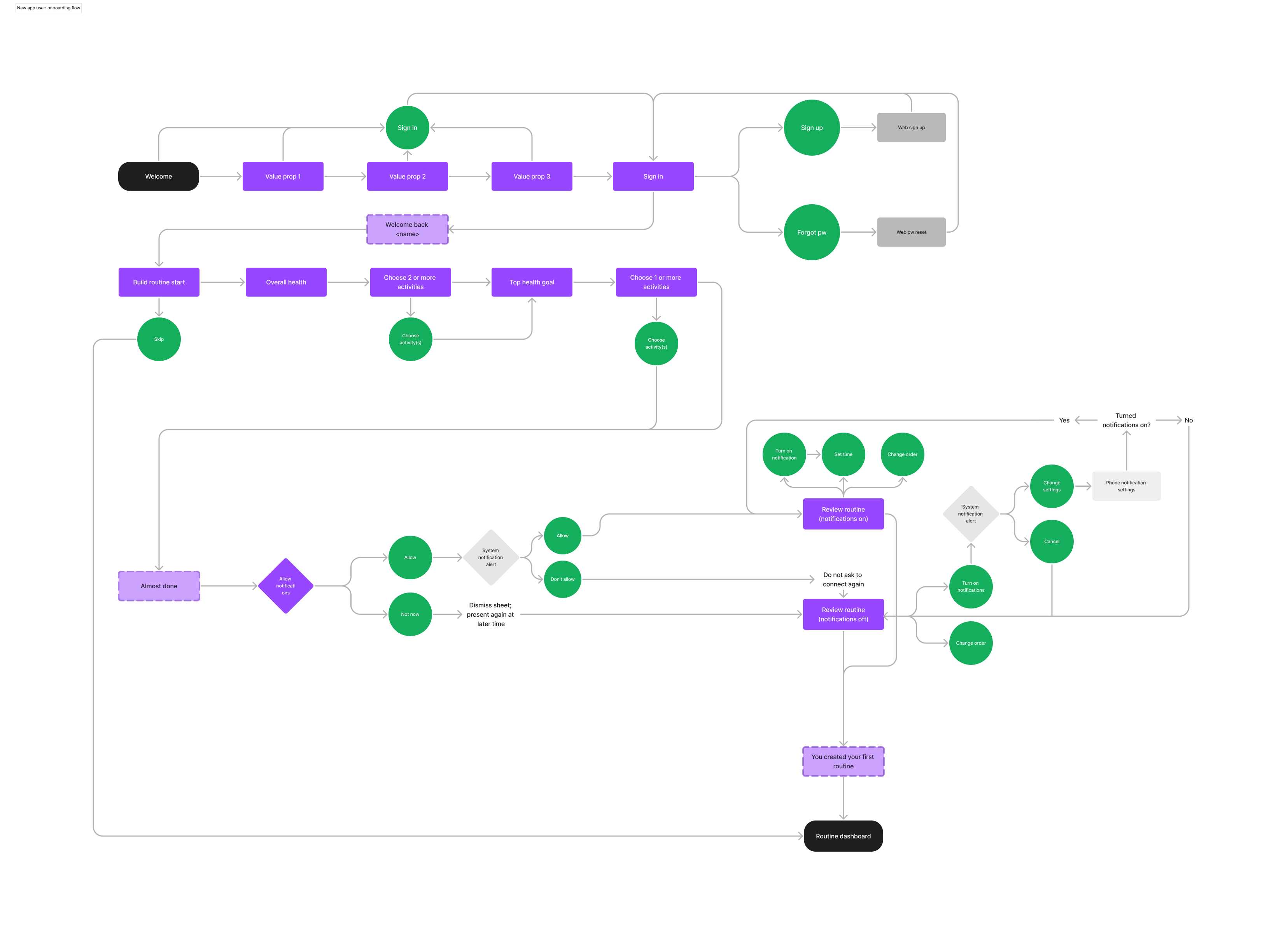
User flows
User flows were created to better understand how everything fit together holistically, including tracking, onboarding, backtracking, and editing routine. This was when we started considering how we might solve for our retail experience (Target, Sam's Club, and Amazon), and other use cases and instances.
Onboarding
Tracking dashboard
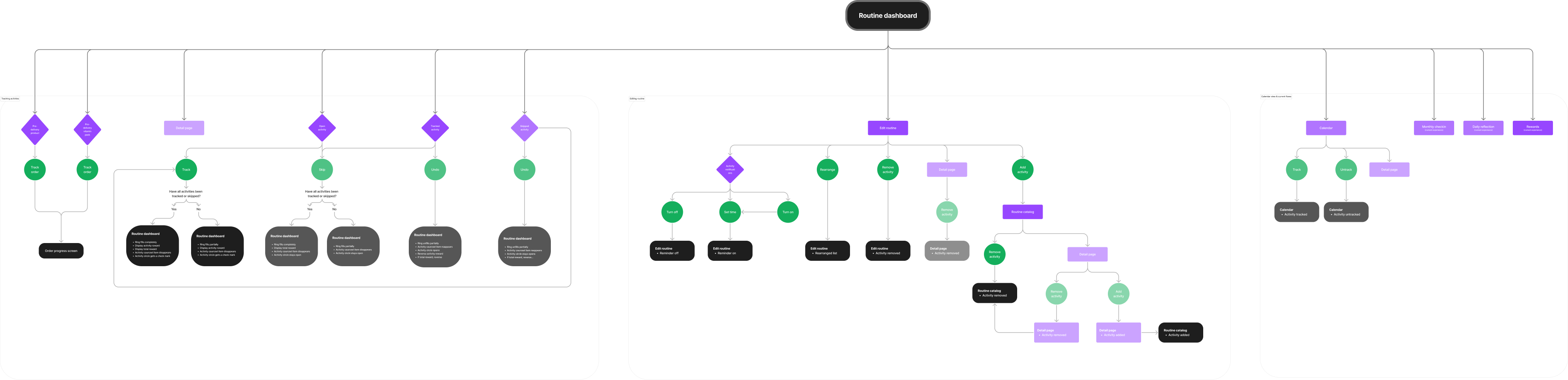
Tracking
The carousel of routine items also contained Care/of separate flows. The daily reflection and monthly check-in features enabled an experience for more personalization and guidance. Based on user insights, we heavily leaned into rewards and streaks for the MVP ring content while also highlighting recommendation content on initial track state.
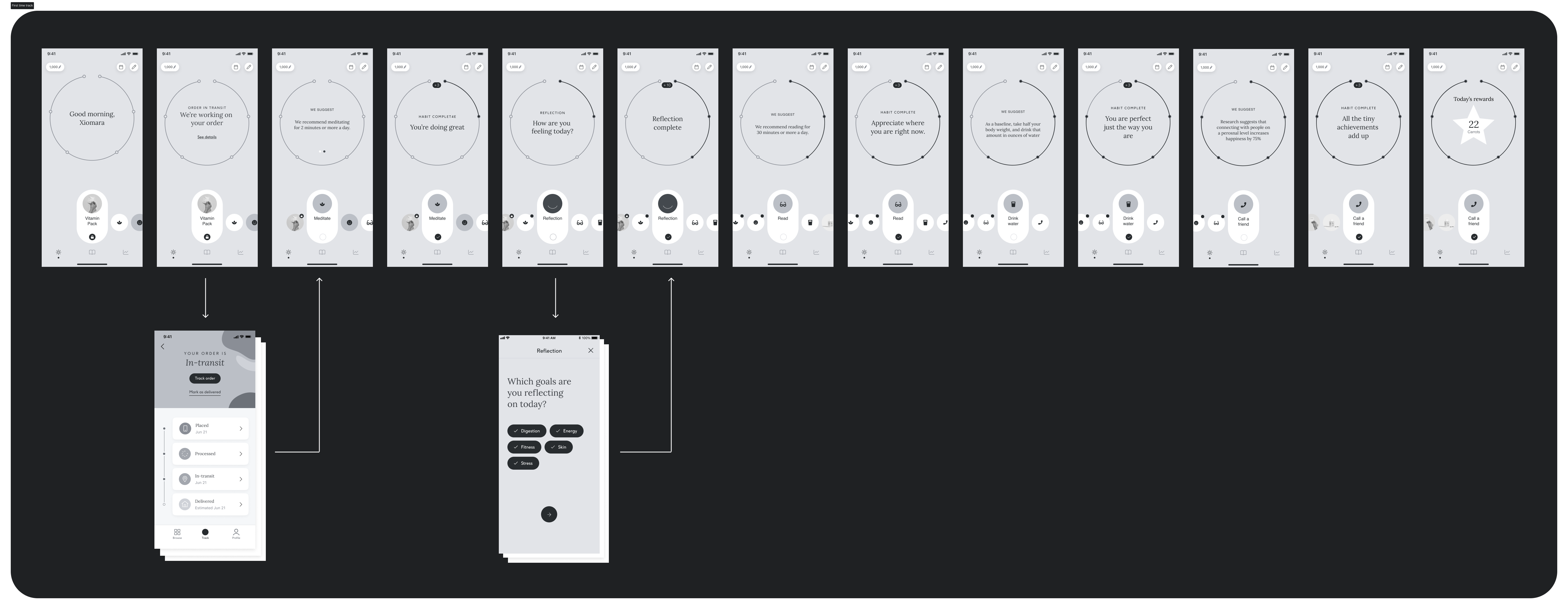
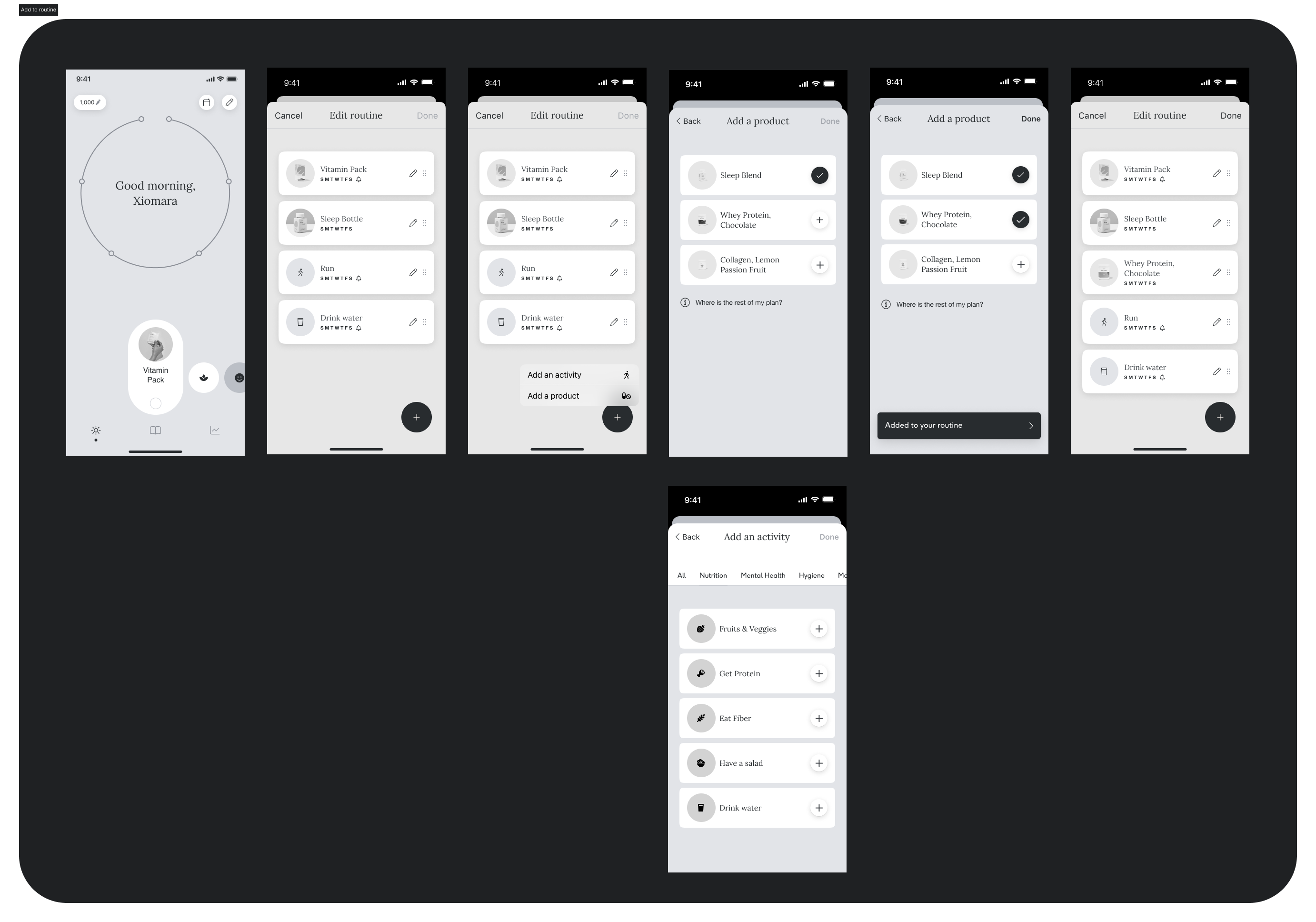
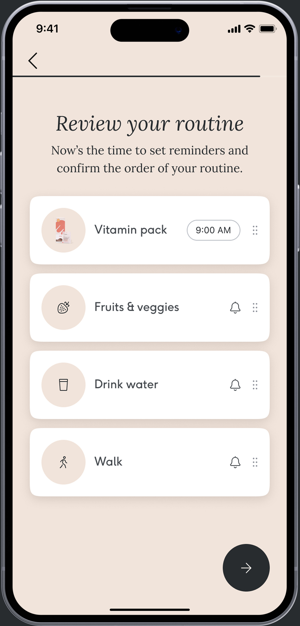
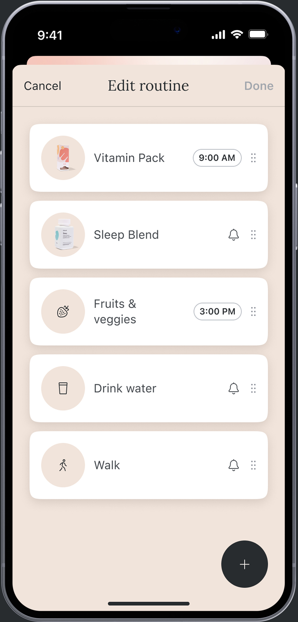
Editing routine
For MVP, we launched all habits to be daily, but we knew that users needed more flexbility when scheduling their routines. Therefore, I set up a framework for future innovation and scaleability. Future iterations will likely include habit insights and content in detail screens; more habit scheduling and goal settings.
Onboarding
We user tested two onboarding tactics, which we internallly referred to as conversational and contextual. The primary goal of the onboarding was to enable users to form a routine that set them up for success. Below were the areas of focus:
Recommendation
We aimed to understand how much control or guidance users wanted over their routine.
Personalization
We aimed to find levers that were most effective in expressing personalization.
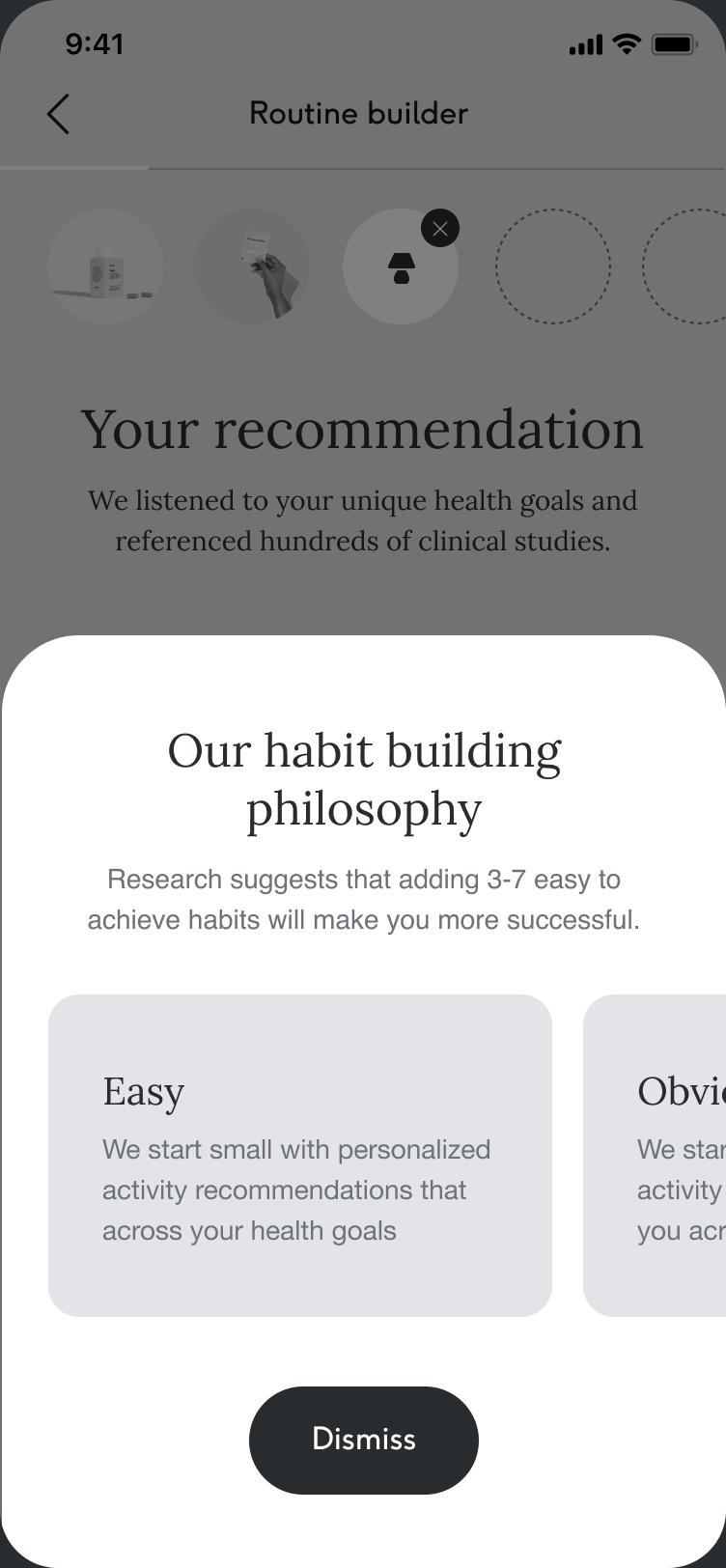
Philosophy
We aimed to understand if our tactic of limiting the number of habits selected during onboarding was compelling.
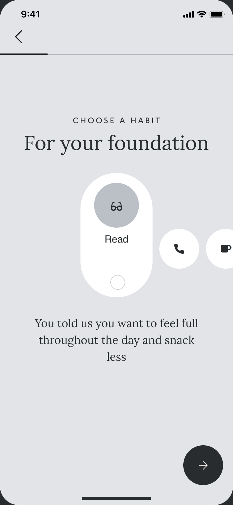
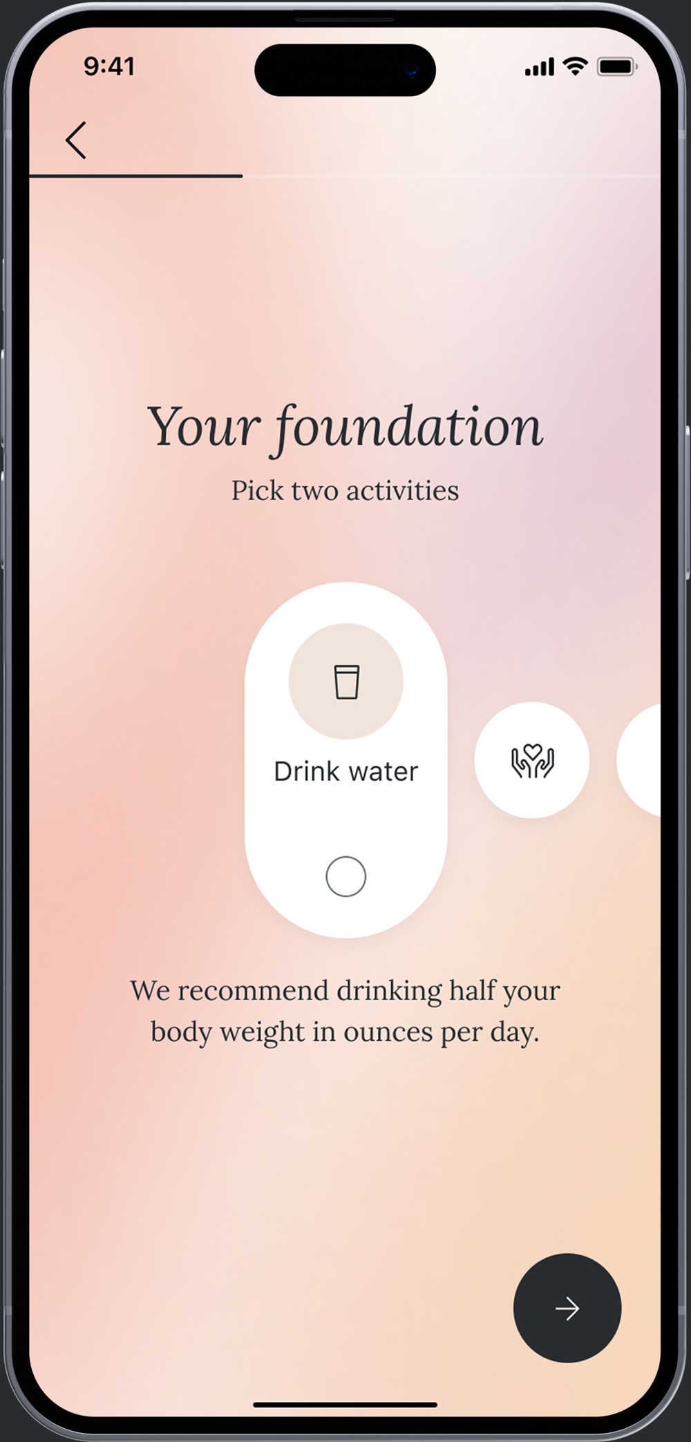
Conversational
The conversational routine builder takes the user through their goals one by one, mimicking a doctors interview and asking them to build their routine one item at a time. Users found this direction highly usable, motivating and understandable.
Dynamic shareback interstitial
Conversational introduction

Foundational selection
Intention journal entry


Contextual
The contextual routine builder gives the user the ability to build their routine in a single view and see their routine as it comes together. While this direction was shorter, users found it less understandable and missed the guidance from the conversational direction.
Health goal selection

Personalization interstitial
Limited habit selection

Habit philosophy modal

High-fidelity design
The Care/of brand is embraced internally more than many companies. When going into high-fidelity design, I knew that the executive leadership understood the importance of showcasing the high-level of craft that Care/of is known for. I presented various visual directions for the new tracking experience, which would cascade across the rest of the app. The direction we aligned on changes color based on the time of day.

Animation sample
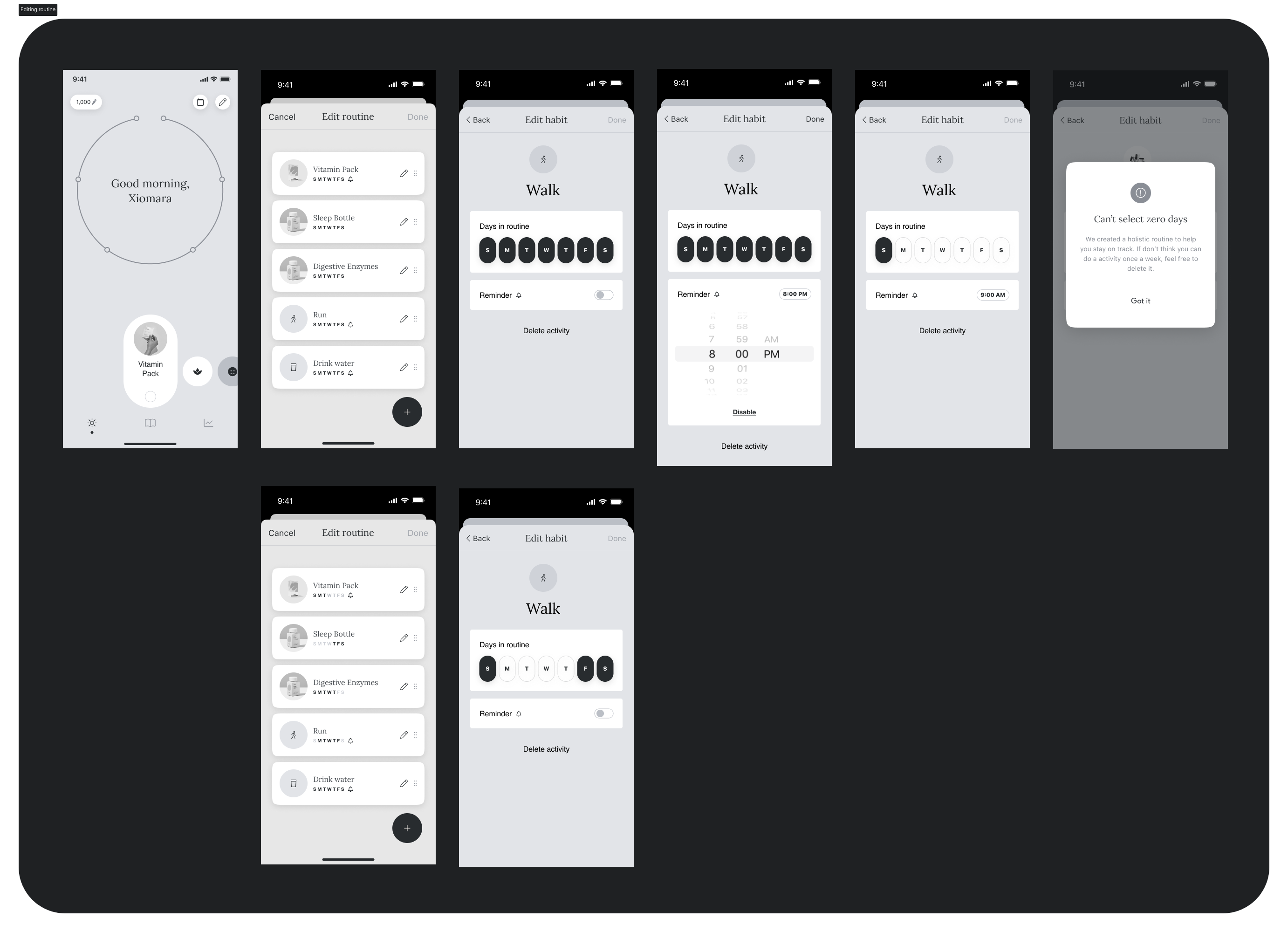
Backtracking


Onboarding

Editing routine
I relied on existing mobile patterns for the utility portion of the tracking experience. Post MVP launch, we held a qualitative user research session to understand how users schedule their routines and the pain points they experience when scheduling their wellness routines. Going forward, the team will be scheduling habits by daily and weekly paradigms.


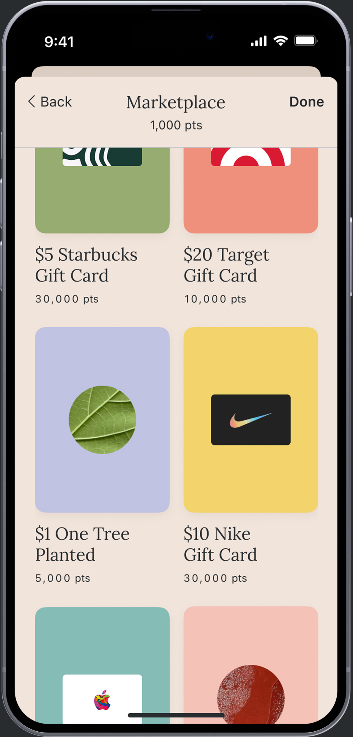
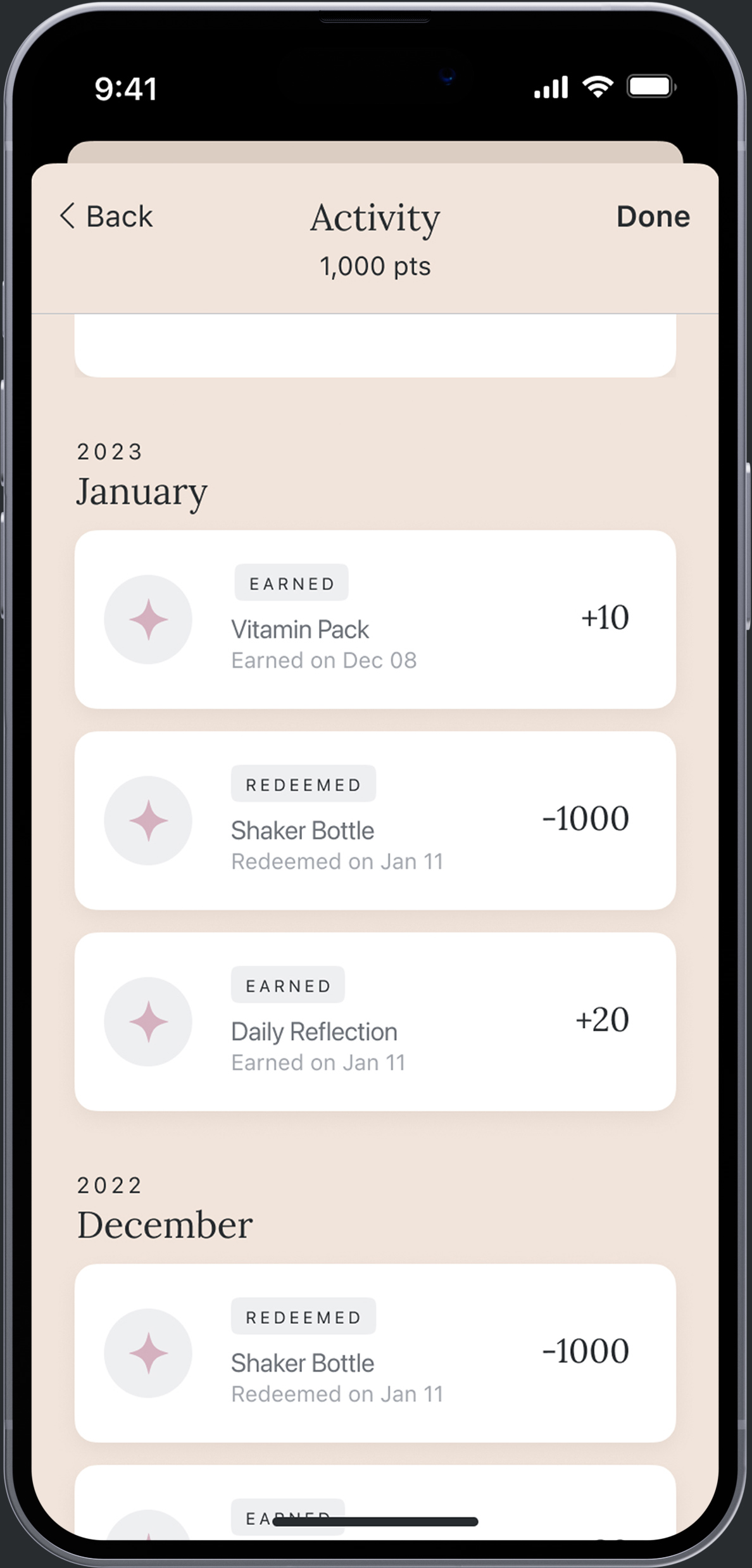
Rewards
The rewards dashboard was completed about a year before routines & reflections. The initial problem aimed to solve confusion around how rewards are earned. By bringing rewards into the main tracking dashboard and include rewards education and activitiy feed, the experience reflected user needs and insights.

Early results
We initially launched routines and reflections to 10% of users which was received extremely well by users, with the vast majority of respondents to our ask for feedback being positive, and 9/10 of the users we spoke to in our first round of user research saying they preferred the new experience to the old one.
4%
INCREASE IN
BOX COUNT
7%
DECREASE IN
CANCEL RATE
$2.50
NET REVENUE
GAIN
13%
DAILY APP
EVENTS INCREASE
Fast follows & iterations
Onboarding
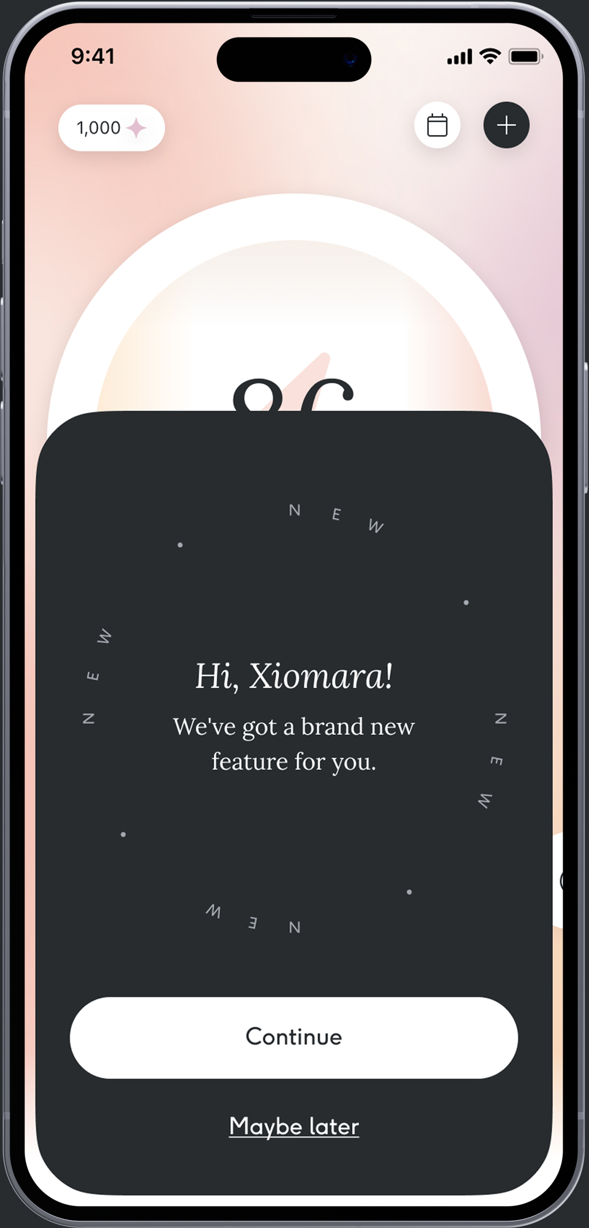
Many skipped onboarding, resulting in a large set of users without context or routines. We solved this by adding a one-time "build a routine" habit, an "add" navigation action, and replacing the commonly used "what's new" sheet with a more branded modal.
Insights
The insights portion of the app highlights results over time through the use of correlations (activities, health goals, mood), community (personal stats/trends, leaderboards), personal guidance (product efficacy, habit psychology, milestones) and rewards.
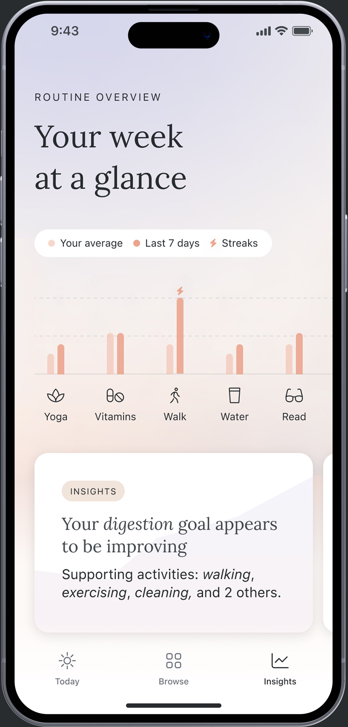
Progress over time
We learned in UR that users of our old experience enjoyed and were motivated by knowing the reward amount they were working towards. We are ideating on new solutions, including concentric and single activity rings to highlight rewards achieved over time.
