Care/of — An intuitive experience for scaleable product innovation
SERVICES
User Interface, User Experience, Design System, Product Planning
DESCRIPTION
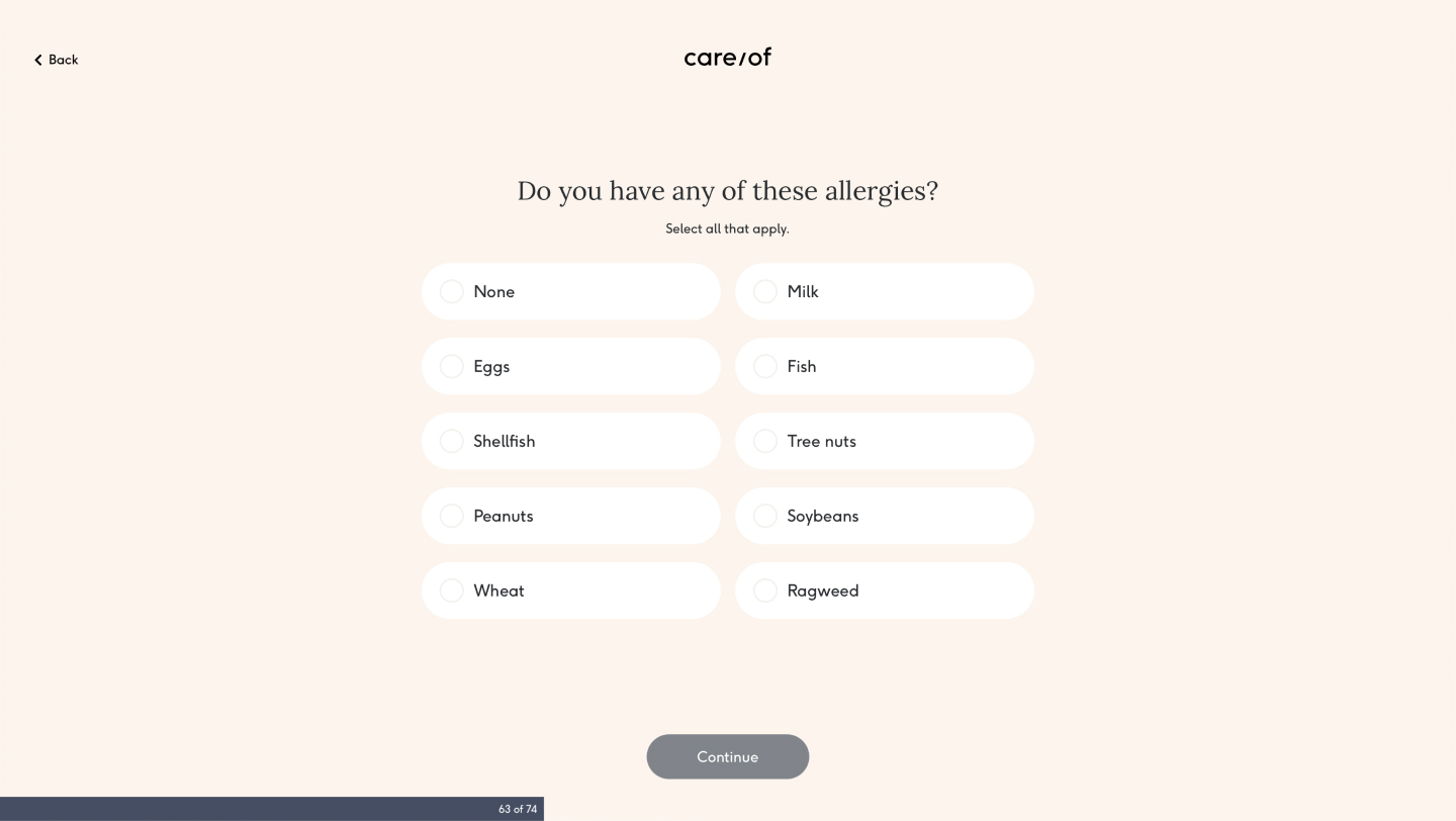
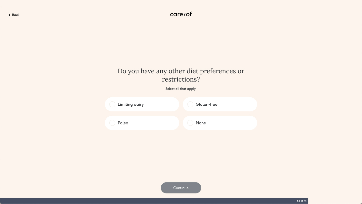
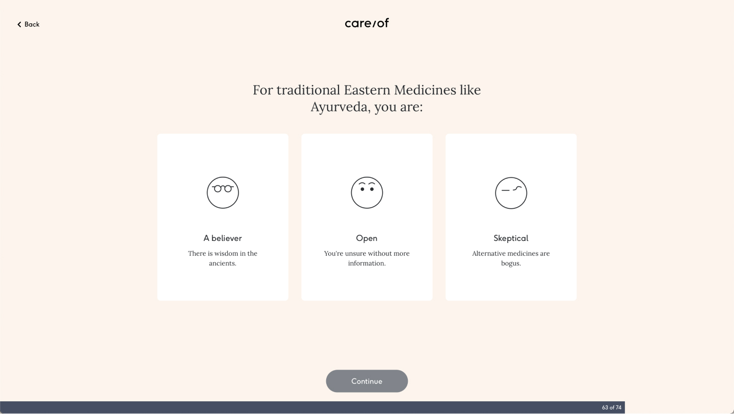
Care/of's hero product from conception was their Vitamin Pack and the digital product reflected this, creating a confusing experience that did not emulate the business offering. The goal of this strategic project was to determine how the digital experience should scale to allow users to make informed and appropriate purchasing decisions as Care/of scaled their physical product offering.

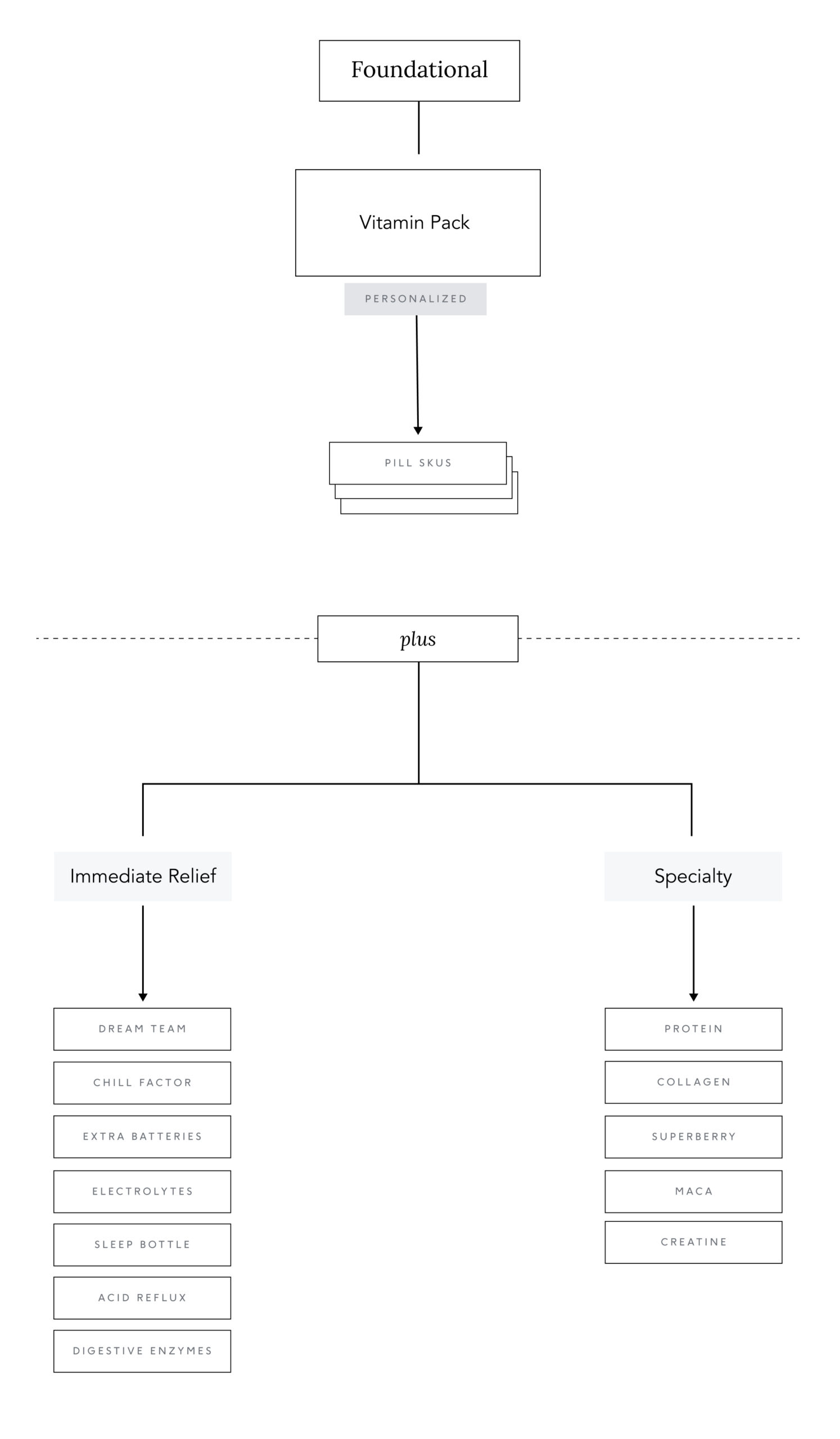
Product hierarchy strategy
The goals was to define a digital solution that aligned with product use guidelines that allowed Care/of to scale with future form factor innovation. Usage-led framework determined how we thought about physical product innovation moving forward. We applied this thinking to all aspects of the digital product but my main focus was the navigation, recommendation, product catalog, and cart.
Concept testing
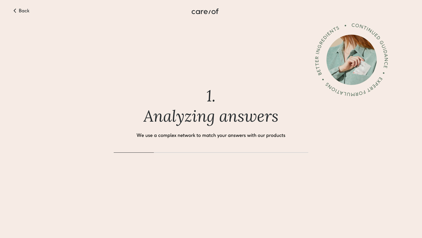
There were various rounds of user testing to get feedback from users on how the product hierarchy came to life in digital. A secondary goal of the project was to diversify ways of shopping so Care/of could be less reliant on the quiz. The quiz was the primary way users converted on the website but less and less users were converting over time. The hypothesis was that if we diversifed the way in which users can get Care/of products, the more likely they will convert.
Recommendations
Through user testing we aimed to understand how an organization that prioritized Vitamin Pack impacted:
- Perception of Care/of’s product offering
- Willingness to buy
- Trust in the recommendation
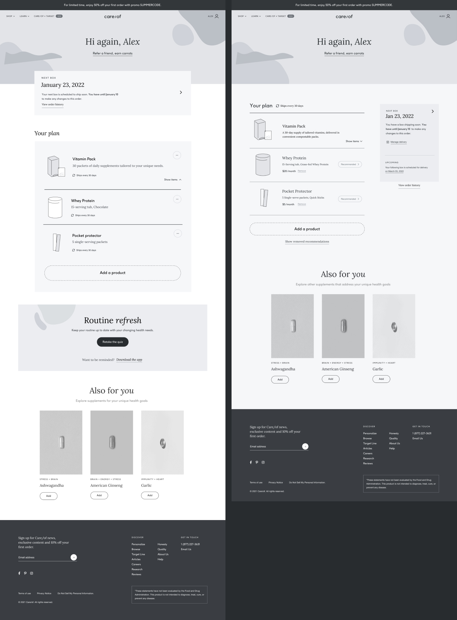
Subscription management
Through user testing we aimed to understand what levers are most clear for exercising control. We aimed to were solve for:
- Flexibility in how often the user can receive products, in order to mitigate subscription aversion
- Encourage users to user products longer-term, even if they don’t receive them from Care/of every month
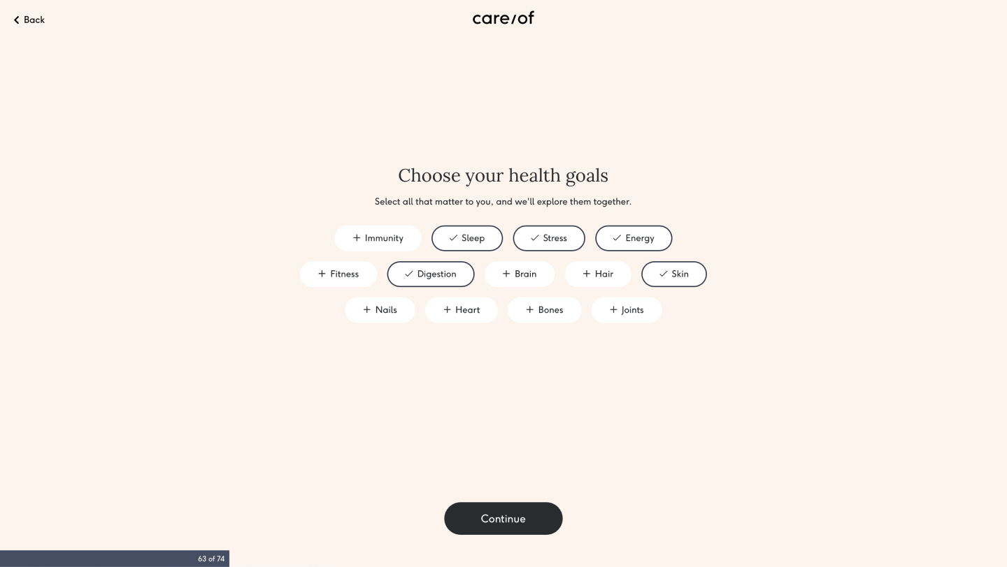
Quiz recommendation
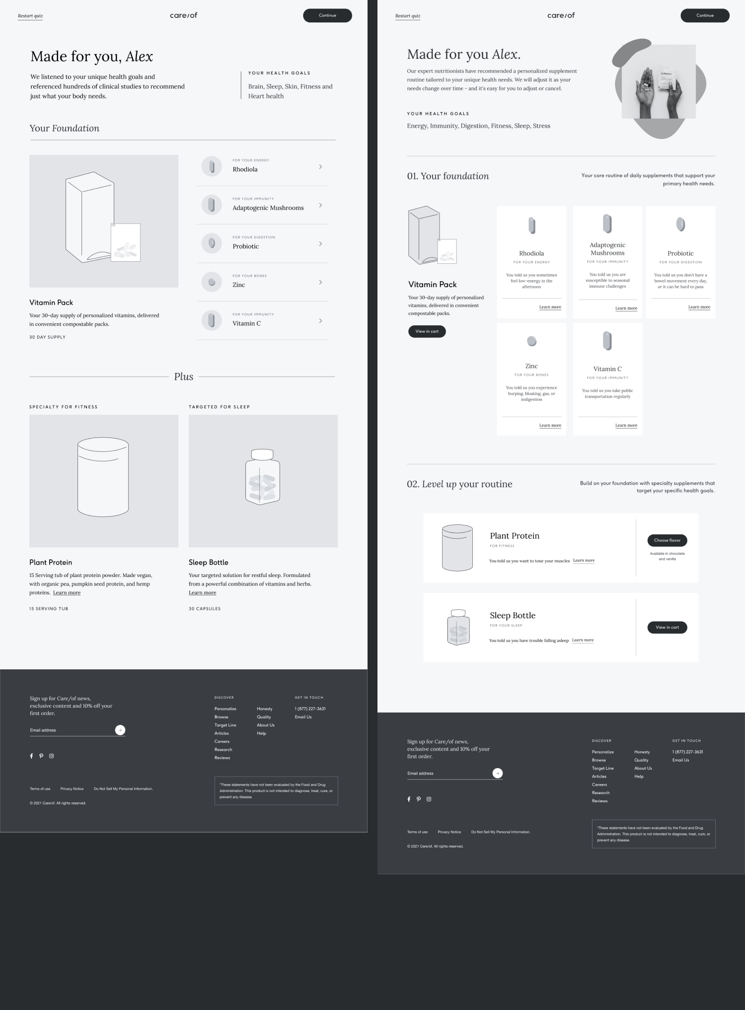
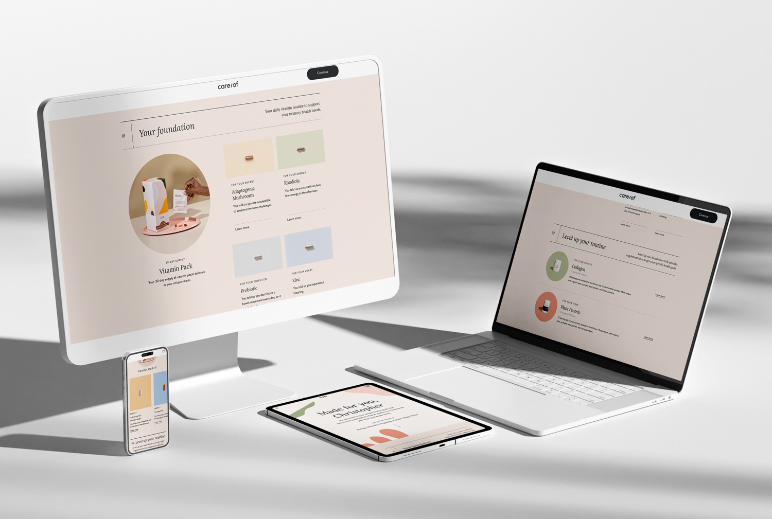
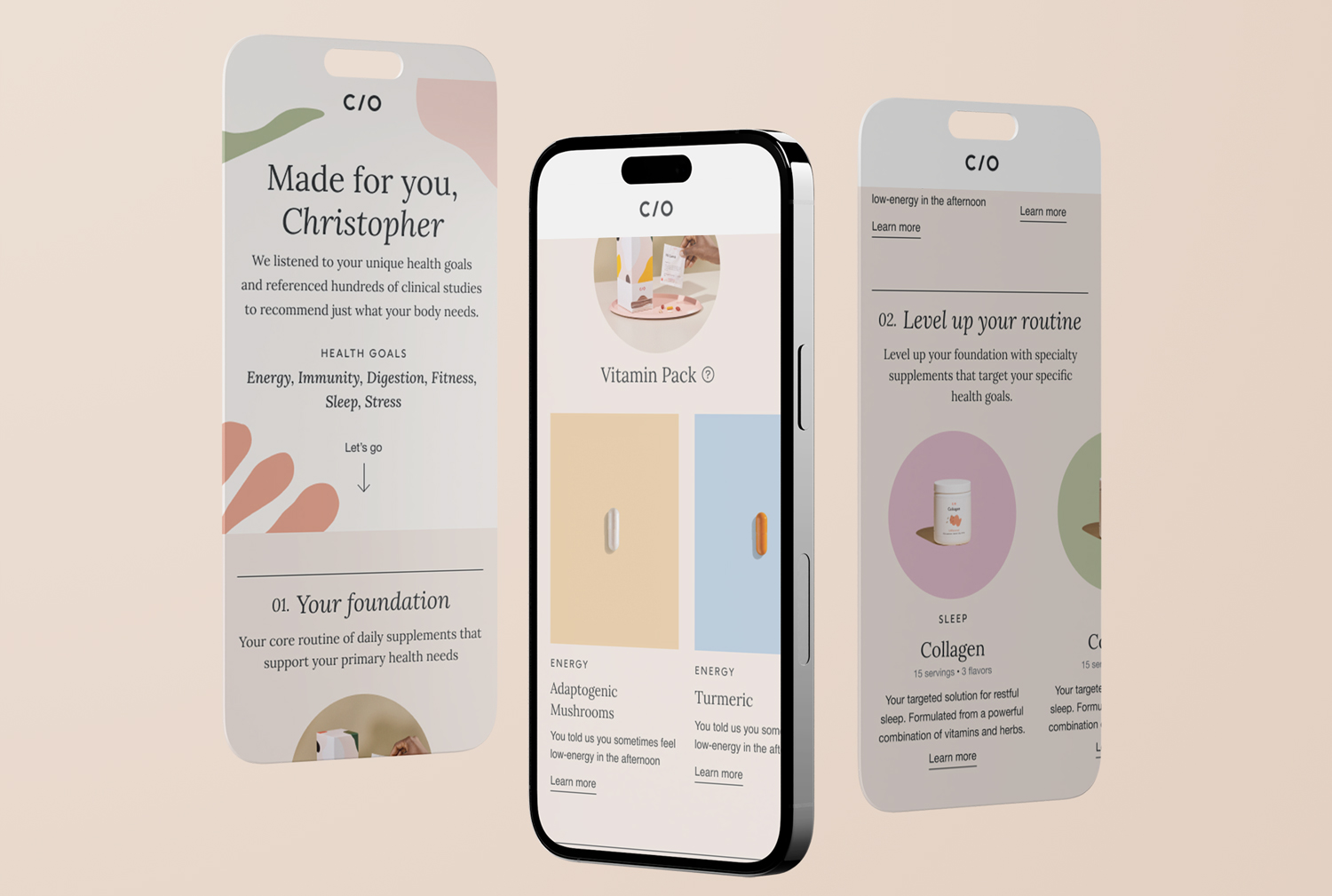
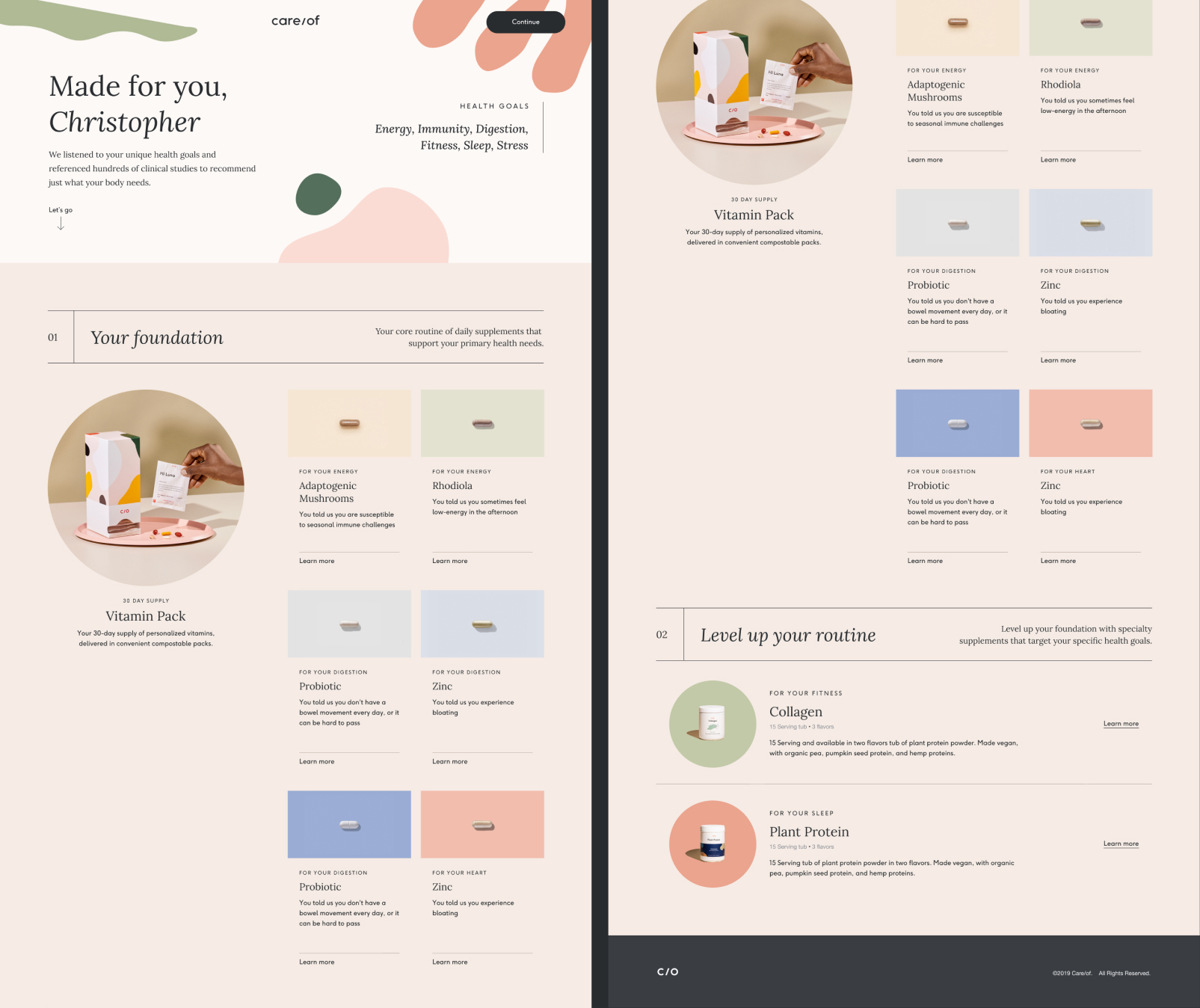
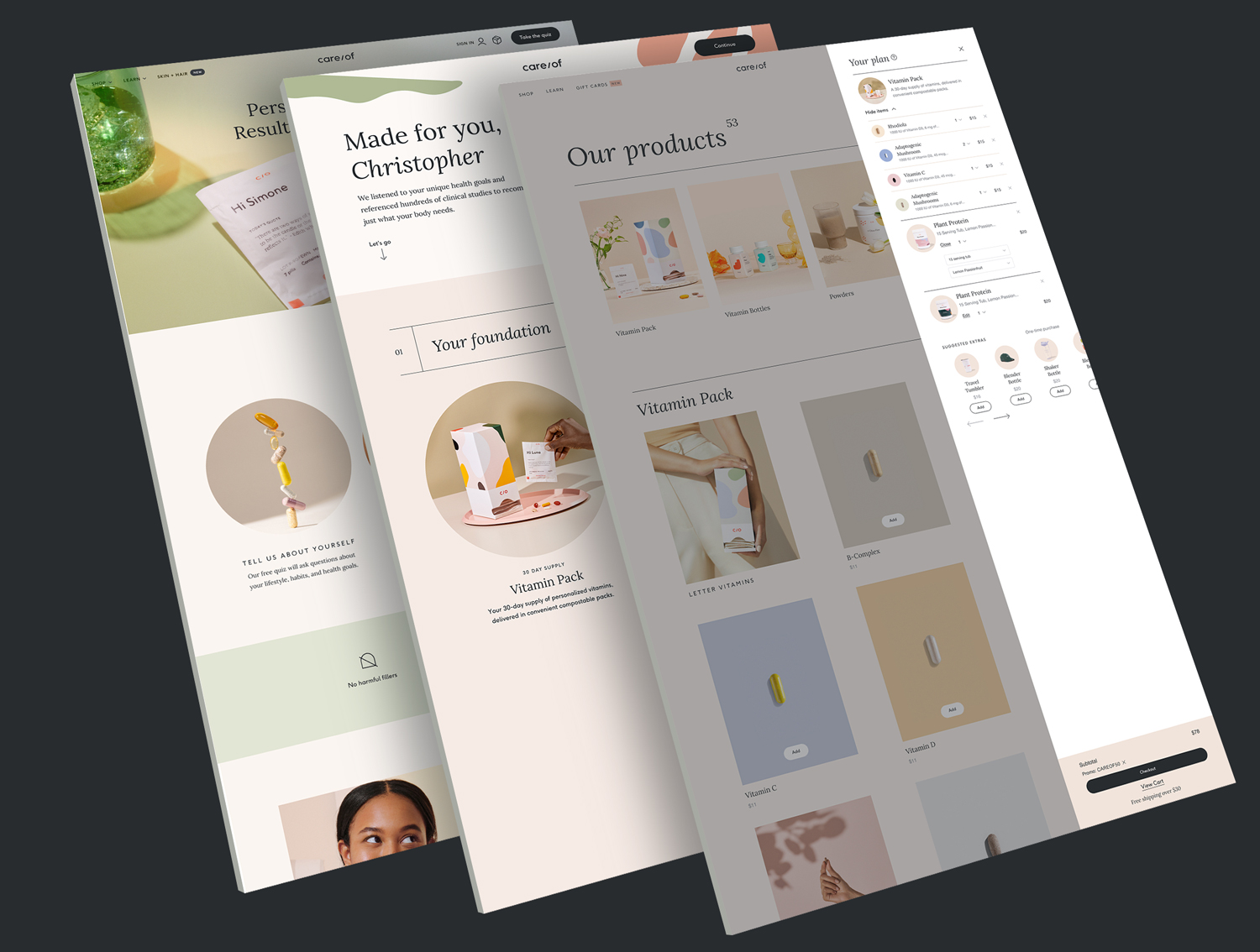
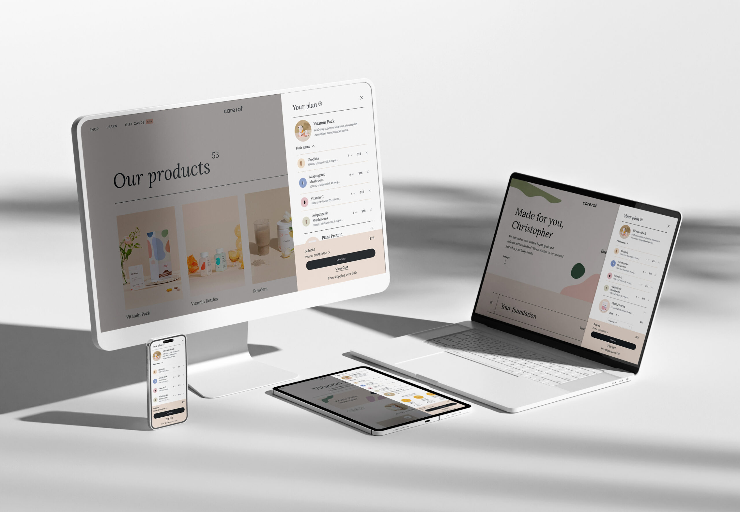
After taking the quiz, users needed to be able to understand why they are being recommended certain products within a clear hierarchy. The hypothesis was that if we redesigned the Recommendations page with a clear hierarchy of product types, users would better understand their recommendations (the additional support product specifically), resulting in increased scalability and ability to recommend products besides the Vitamin Pack. We ran various A/B/N tests in the quiz and recommendation to see what messaging best worked with Care/of users.
User research insights
1.
Most people understood in either version that additional support items, were secondary, regardless of language. “Level up your routine” seemed more personalized, less of an upsell.
2.
For the familiar Vitamin Pack product, personalized “You told us” copy was more valuable. For additional support products, descriptions of the products themselves and their ingredients were more valuable.
3.
Most users were not put off by adding all products to cart, including additional support items and were comfortable with removing any unwanted items at the cart step.
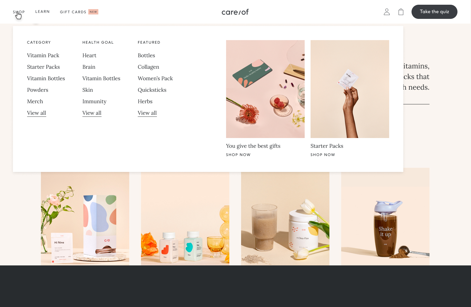
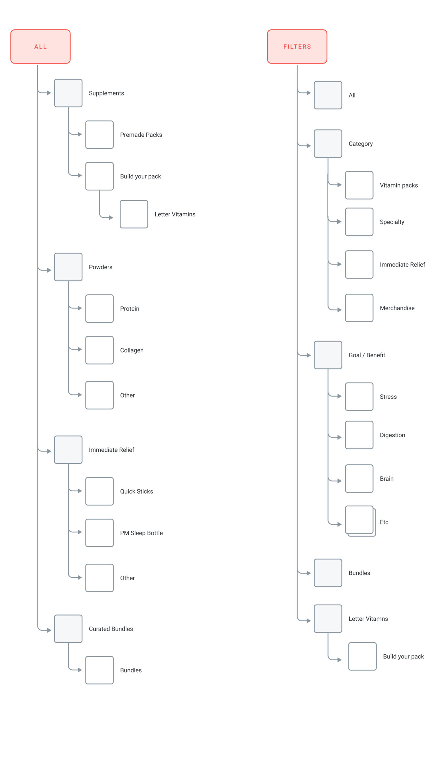
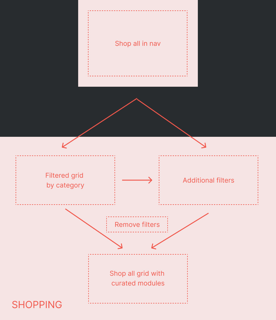
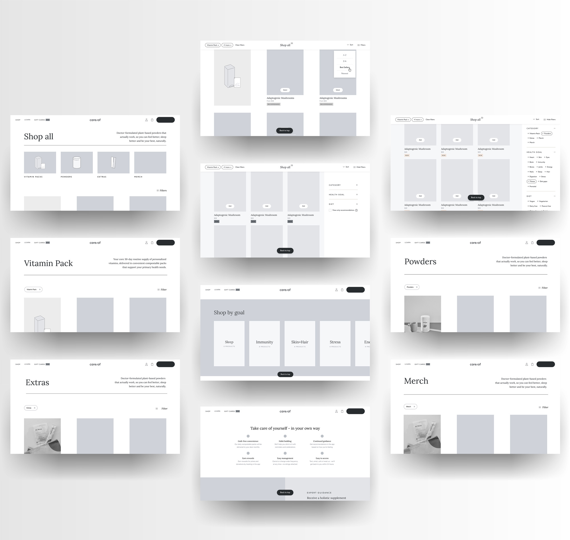
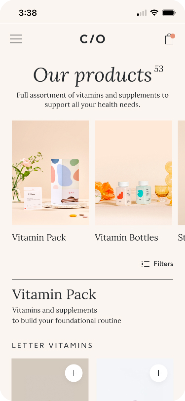
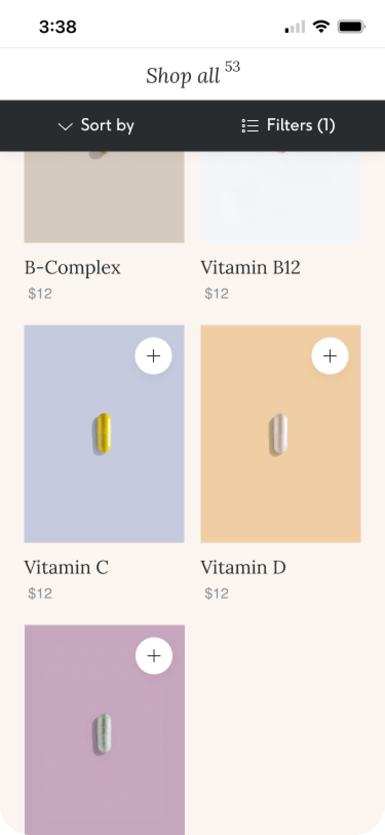
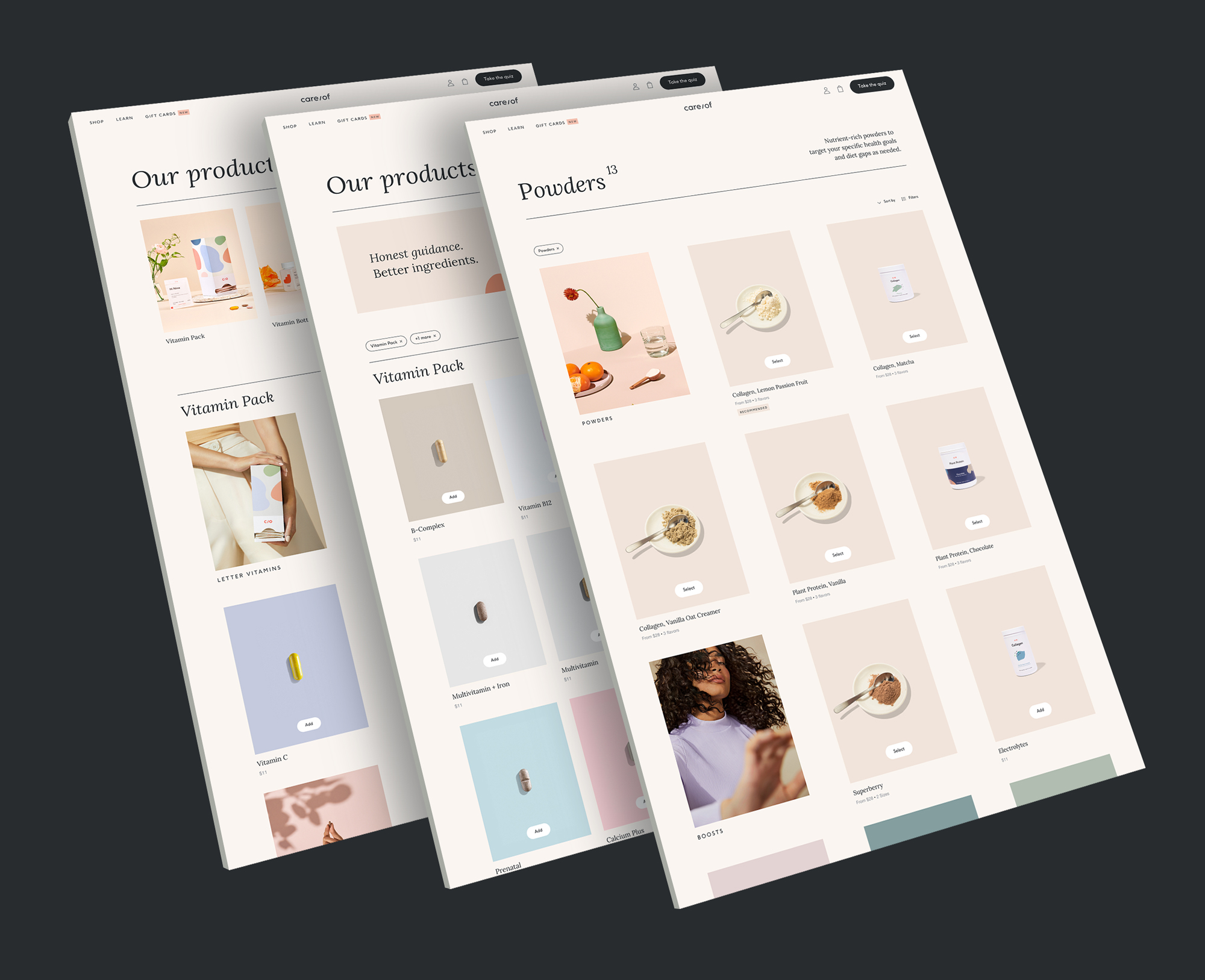
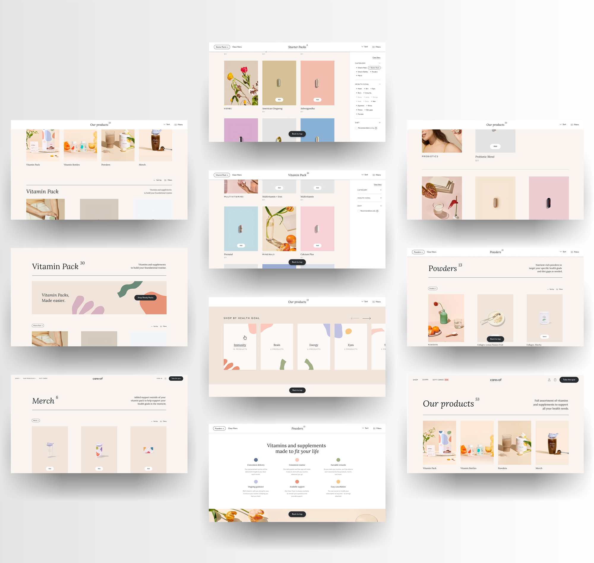
Product catalog
The product catalog had not been revisited since the launch of the business. This allowed us the opportunity to use e-commerce best practices to strengthen Care/of's offering by leveraging common filter and sort functions and pulling in key product information to keep users on page like in-line add to cart and adding in-line conversion modules. The catalog served as the first and primary focus for diversifying ways of shopping outside of the quiz. The use of product category landing pages strengthened our SEO and created more diversity in ways of shopping.
Key design changes
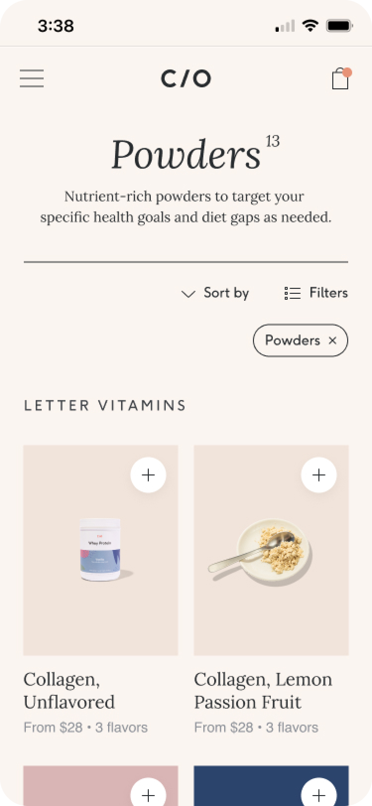
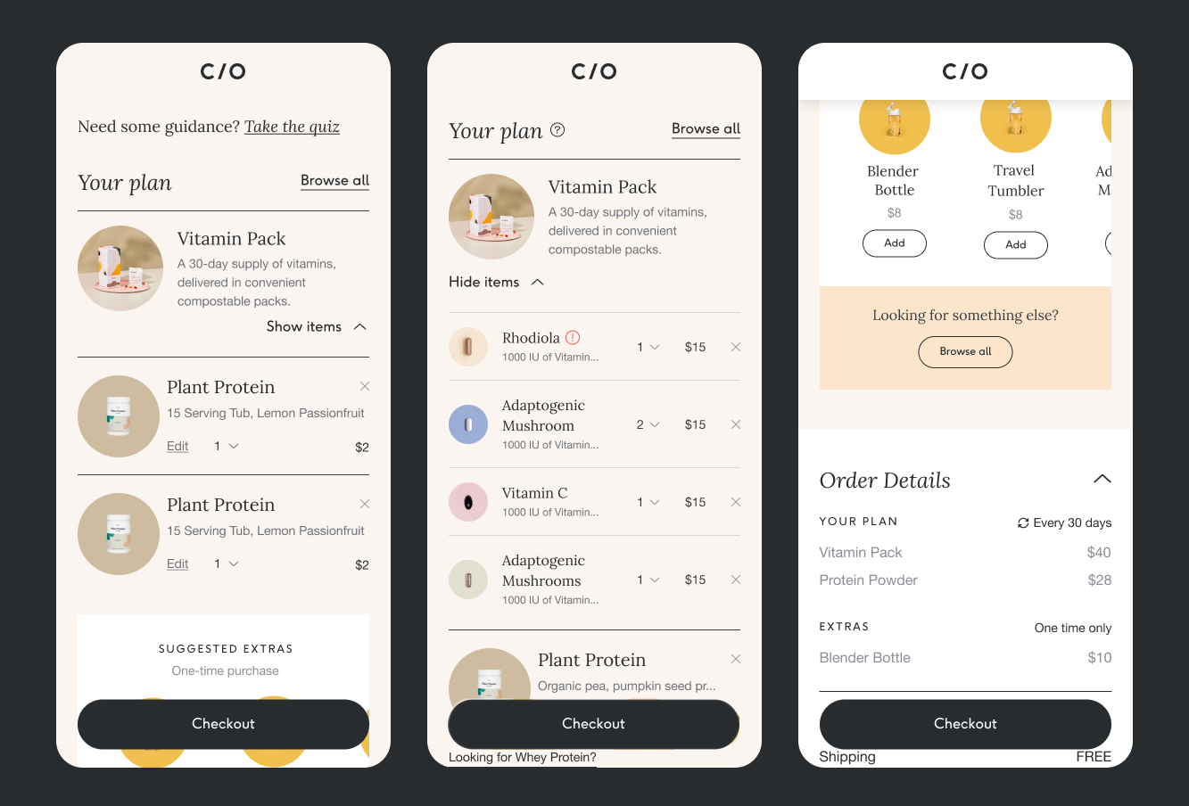
Shoppable product card
On desktop, the product card on hover displays a one-liner product description and associated health goals. On mobile, a sheet popped over the image. This helped users stay in the shopping experience, rather than search for more information on a detail page. We also built an in-line product attribute selector that enabled further flexibility.
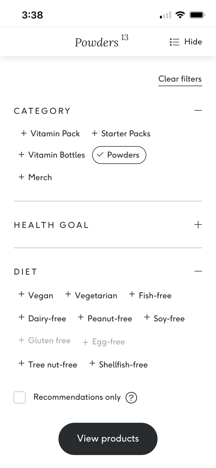
Powerful filter system
An expanded filter system was introduced, by adding category filters a user is effectively taken to a category page. We built a way to stop users from getting zero products by disabling filters when they didn't produce results. New filters were introduced, like dietary and recommended. The result was a more personalized and flexible shopping experience.
Conversion focused modules
Additional modules were added to focus on specific user needs, like needing more personalized product guidance, shopping with a health concern in mind, and more introductory Care/of modules. The result was a shop by health goal, take the quiz, and the benefits of Care/of's subscription modules.
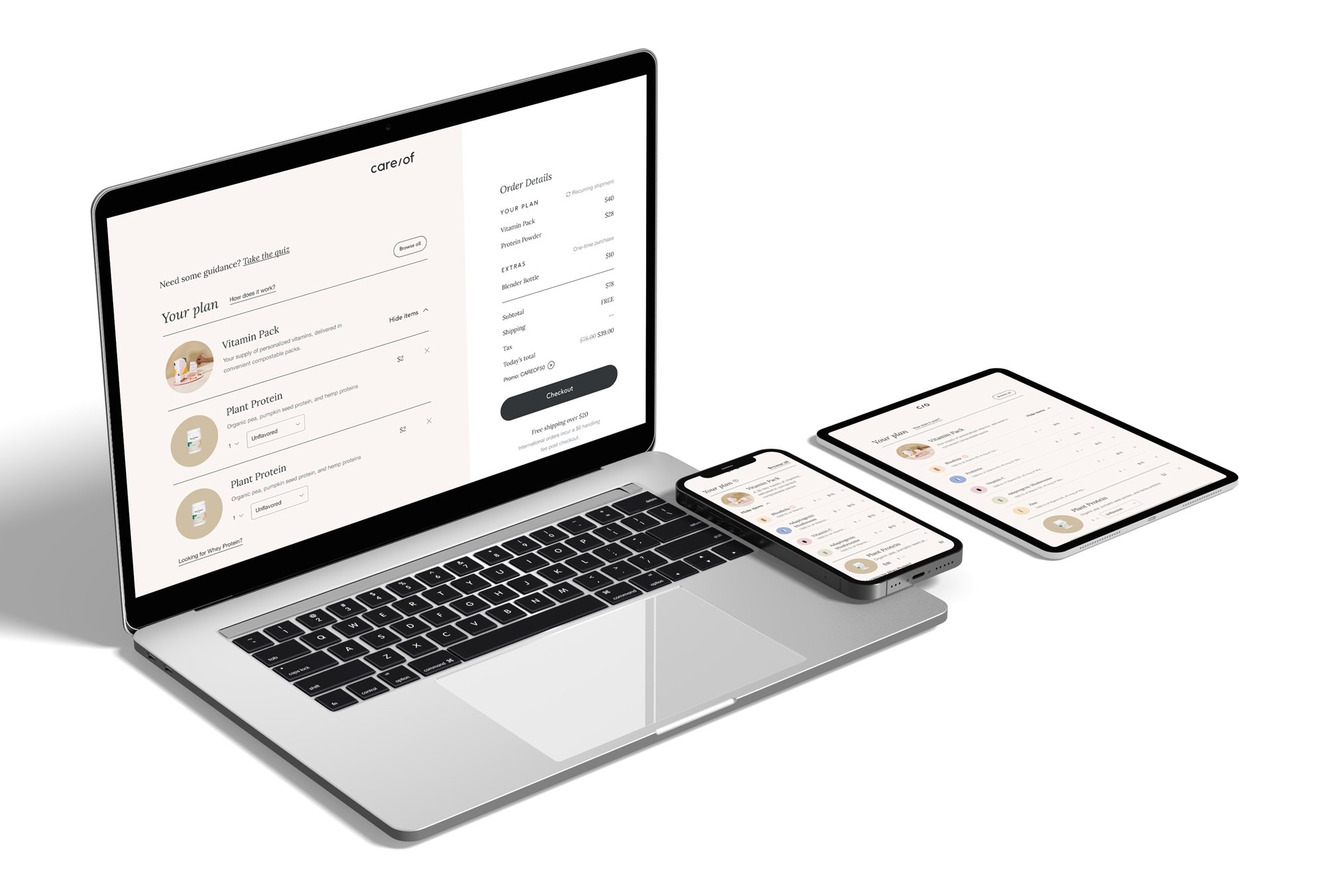
Cart page & side cart
The cart redesign was a huge success, increasing conversion by over 10% by leveraging key e-commerce best practices. By treating the Vitamin Pack as a hero product beside other form factors, users better understood what they were buying. Additionally, various A/B/N tests were run using a side cart across the experience. The hypothesis was that if users had more control over their plan, the more likely they will check out with a higher order value.
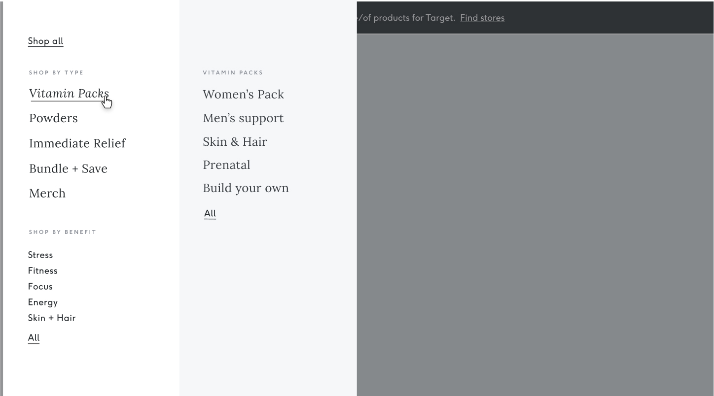
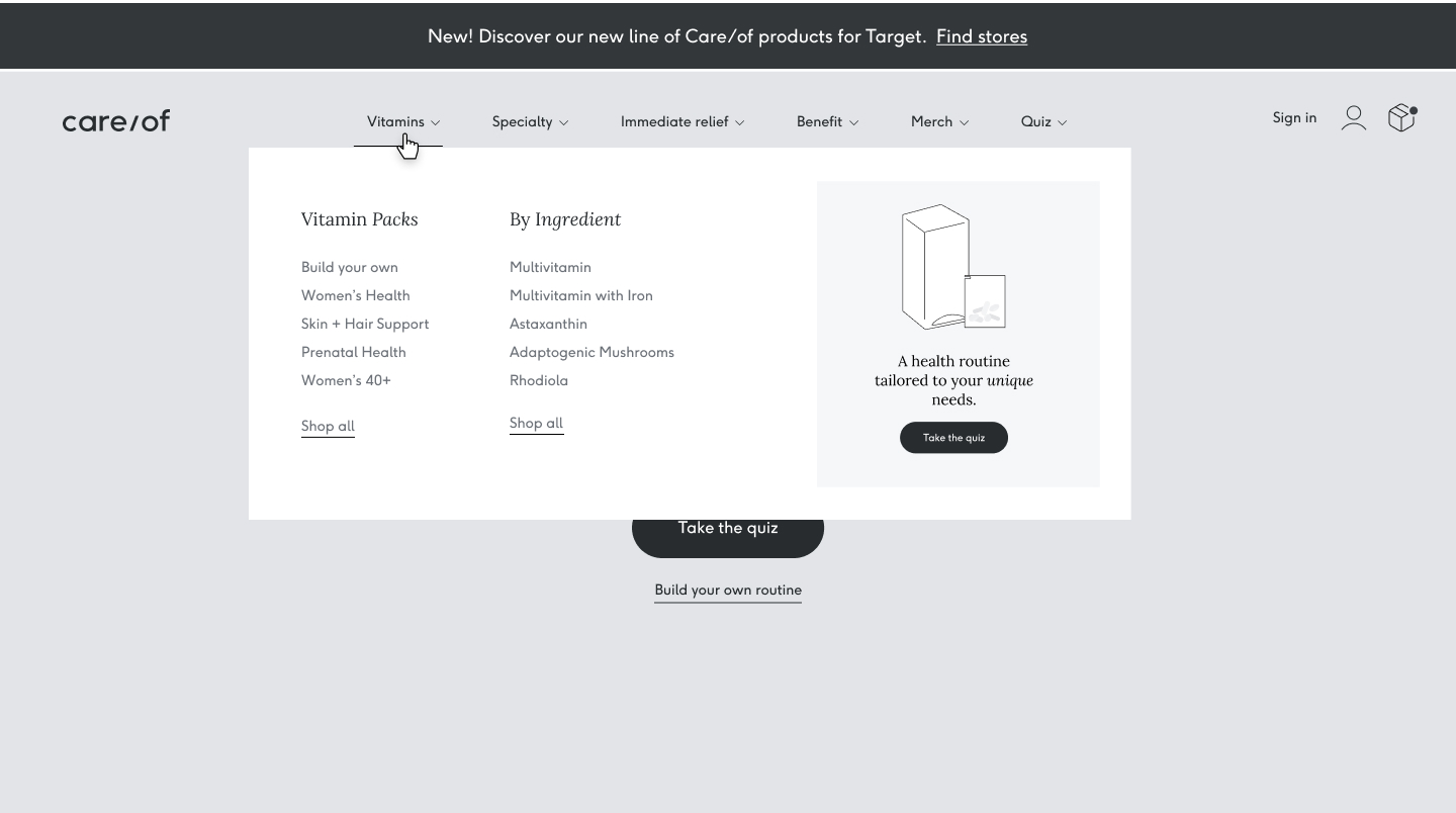
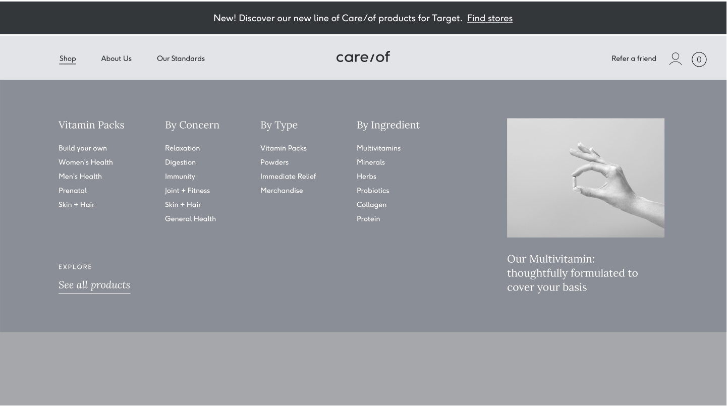
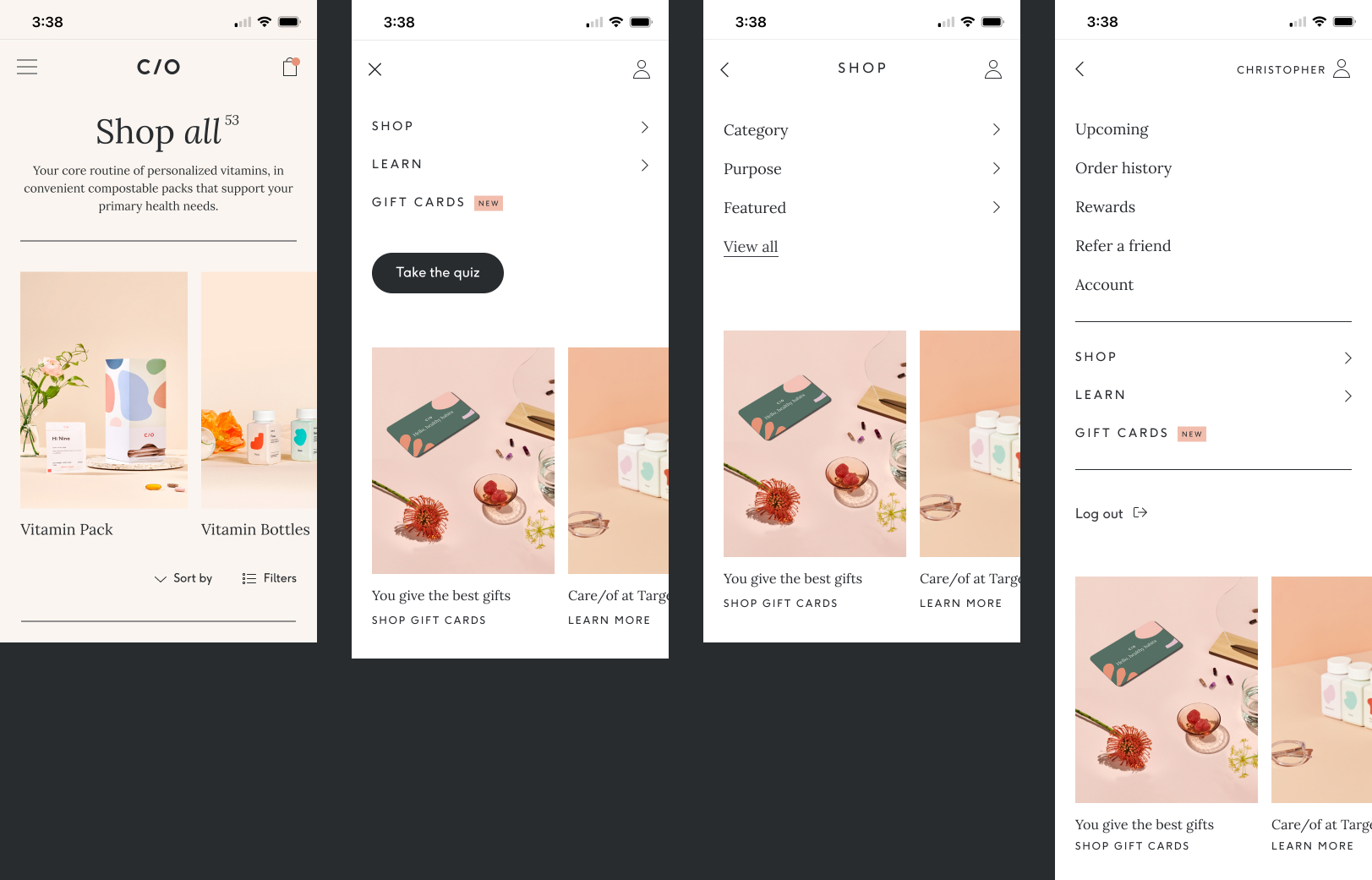
The navigation
Various navigational systems were explored and analyzed to find the right performant brand fit that delivered the product hierarchy and set Care/of up for success. We considered navigations that would enable brand link highlights, scaleability, and performance.